Available classes
Currently, there are two classes (Analysis and PlotAll) available in the predictr package. I will continue to add new classes in near future.
Analysis
Analysis contains all necessary methods for the Weibull analysis. Since version 0.1.34, it also supports dist='normal', dist='lognormal' and dist='exponential' - see Distributions below.
Default arguments and values
This table provides information on alle arguments that are passed to the Analysis class.
| Parameter | default value | type | description |
|---|---|---|---|
| df | None | list of floats | List of failures |
| ds | None | list of floats | List of suspensions (right-censored only) |
| dist | 'weibull' | str | Distribution to fit: 'weibull', 'normal', 'lognormal' or 'exponential' |
| bounds | None | str | Confidence bounce method to be used in mle() or mrr() |
| bounds_type | None | str | Setting for the bounds: either two-sided or one-sided |
| show | False | bool | If True, the Weibull probability plot will be plotted |
| bcm | None | str | Defines the bias-correction method in mle() |
| cl | 0.9 | float | Sets the confidence level when bounds are used |
| bs_size | 5000 | int | Number of bootstrap samples |
| est_type | 'median' | str | Sets the statistic to compute from the bootstrap samples |
| plot_style | 'predictr' | str | Choose a style according to your needs. 'predictr' is predictr's own built-in style (no setup required); see matplotlib style references for other available styles. |
| unit | '-' | str | Unit of failures and suspensions, e.g. 's', 'ms', 'no. of cycle' etc. |
| x_label | 'Time to Failure' | string | Label for the x-axis |
| y_label | 'Unreliability' | string | Label for the y-axis |
| xy_fontsize | 12 | float | Fontsize for the axes label |
| tick_fontsize | 10 | float | Fontsize for the tick labels (the numbers on the axes) |
| legend_fontsize | 9 | float | Fontsize for the legend |
| plot_title | 'Weibull Probability Plot' | string | Title for the plot |
| plot_title_fontsize | 14 | float | Fontsize of the plot title |
| fig_size | (6, 7) | tuple of floats | Sets figure width and height in inches: (width, height) |
| save | False | boolean | the beta and eta length of lists. |
| plot_ranks | True | boolean | If True, median ranks will be plotted. |
| show_legend | True | boolean | If True, the legend will be plotted |
| kwarg: path | string | Path defines the directory and format of the figure E.g. r'var/user/.../test.pdf' |
Important:
- df = None will raise an error. There has to be at least one failure.
Parameter estimation methods
One can either use the Maximum Likelihood Estimation or Median Rank Regression.
Maximum likelihood estimation (MLE):
from predictr import Analysis
prototype_a = Analysis(...) # create an instance
prototype_a.mle() # use instance methods
Median Rank Regression (MRR)
from predictr import Analysis
prototype_a = Analysis(...) # create an instance
prototype_a.mrr() # use instance methods
Non-parametric descriptions: Kaplan–Meier / Nelson–Aalen
kaplan_meier(cl=None) and nelson_aalen(cl=None) compute the empirical, distribution-free survival S(t) (product limit) and cumulative hazard H(t) straight from the df failures and ds suspensions — no dist, no mle()/mrr(), no DataFrame. Each returns the life table as a pandas.DataFrame: time, n_risk, n_event, n_censor plus surv, surv_se, surv_lower, surv_upper (Kaplan–Meier: Greenwood standard error, pointwise interval on ln(-ln S)) or cumhaz, cumhaz_se, cumhaz_lower, cumhaz_upper (Nelson–Aalen: Var(H) = Σ k/n², interval on ln H); cl defaults to the constructor's cl. show=True (constructor) also draws the step plot with its pointwise band and censoring ticks, predictr style, exactly as mle()/mrr() do.
from predictr import Analysis

failures    = [0.45, 0.68, 0.77, 0.88, 1.48, 1.63, 2.10, 2.90]
suspensions = [1.0, 1.2, 3.3]

a = Analysis(df=failures, ds=suspensions, show=True)
km = a.kaplan_meier()      # DataFrame + KM step plot
na = a.nelson_aalen()      # DataFrame + NA step plot
# the returned life table (right-continuous step function)
km = Analysis(df=failures, ds=suspensions).kaplan_meier()
print(km[['time', 'n_risk', 'n_event', 'n_censor', 'surv',
          'surv_lower', 'surv_upper']])
#    time  n_risk  n_event  n_censor      surv  surv_lower  surv_upper
# 0  0.45      11        1         0  0.909091    0.516...    0.987...
# ...

# a wider pointwise band
km99 = Analysis(df=failures, ds=suspensions).kaplan_meier(cl=0.99)

# uncensored data works too (no ds); surv reaches 0 at the last failure
Analysis(df=failures).nelson_aalen()

# model-free reference next to a parametric fit
a = Analysis(df=failures, ds=suspensions, bounds='fb')
a.mle()                                   # Weibull S(t) = exp(-(t/eta)**beta)
km = a.kaplan_meier()                     # empirical S(t) — compare the two
The same estimators are available on a Regression object (r.kaplan_meier(by=...) / r.nelson_aalen(by=...) / r.plot_km() / r.plot_na()), where by= can additionally split the curve by a covariate (stratified KM/NA — see the Regression examples).
Bias-correction methods
Since parameter estimation methods are only asymptotically unbiased (sample sizes -> "infinity"), bias-correction methods are useful when you have only a few failures. These methods correct the Weibull shape and scale parameter.
The following table provides possible configurations. Bias-corrections for mrr() are not supported, yet.
| Bias-correction method | mle() | mrr() | argument value | config. | statistic |
|---|---|---|---|---|---|
| C4 aka 'reduced bias adjustment' | x | - | 'c4' | - | - |
| Hirose and Ross method | x | - | 'hrbu' | - | - |
| Non-parametric Bootstrap correction | x | - | 'np_bs' | bs_size | 'mean', 'median', 'trimmed_mean' |
| Parametric Bootstrap correction | x | - | 'p_bs' | bs_size | 'mean', 'median', 'trimmed_mean' |
Confidence bounds methods
Analysis supports nearly all state of the art confidence bounds methods. The table below applies to dist='weibull' (the default). For the other distributions, see Distributions.
| confidence bounds | mle() | mrr() | uncensored data | censored data | bounds_type | argument value |
|---|---|---|---|---|---|---|
| Beta-Binomial Bounds | - | x | x | x | '2s', '1sl', '1su' | 'bbb' |
| Monte-Carlo Pivotal Bounds | - | x | x | x | '2s', '1sl', '1su' | 'mcpb' |
| Non-Parametric Bootstrap Bounds | x | x | x | x | '2s', '1sl', '1su' | 'npbb' |
| Parametric Bootstrap Bounds | x | x | x | x | '2s', '1sl', '1su' | 'pbb' |
| Fisher Bounds | x | - | x | x | '2s', '1sl', '1su' | 'fb' |
| Likelihood Ratio Bounds | x | - | x | x | '2s', '1sl', '1su' | 'lrb' |
Important:
- mle() and mrr() support only specific confidence bounds methods. For instance, you can't use Beta-Binomial Bounds with mle(). This will also raise an error. Use the table above to check, whether a combination of parameter estimation and confidence bounds method is supported.
- '2s': two-sided confidence bounds, '1su': upper confidence bounds, '1sl': lower confidence bounds. If Beta-Binomial Bounds are used, the lower bound represents the lower percentile bound at a specific time ((pctl) is added in the plot legend). If Fisher Bounds are used, the lower bound represents the lower time bound at a specific percentile.
Distributions
Since version 0.1.34, dist='normal', dist='lognormal' and dist='exponential' are supported alongside the default dist='weibull'. bcm is not supported for these three (bias-correction stays Weibull-only). Confidence bounds are more limited too:
| dist | mle() bounds | mrr() bounds |
|---|---|---|
| 'weibull' | 'fb', 'lrb' | see table above |
| 'normal' | 'fb', 'lrb' | not supported |
| 'lognormal' | 'fb', 'lrb' | not supported |
| 'exponential' | 'fb', 'chi2' | not supported |
'chi2' is an exact chi-square pivotal confidence interval, only available for dist='exponential' (its single-parameter model has a closed-form pivot, so likelihood-ratio bounds aren't needed there). 'lrb' is available for 'normal'/'lognormal' but not 'exponential' for the same reason, the other way round.
Examples
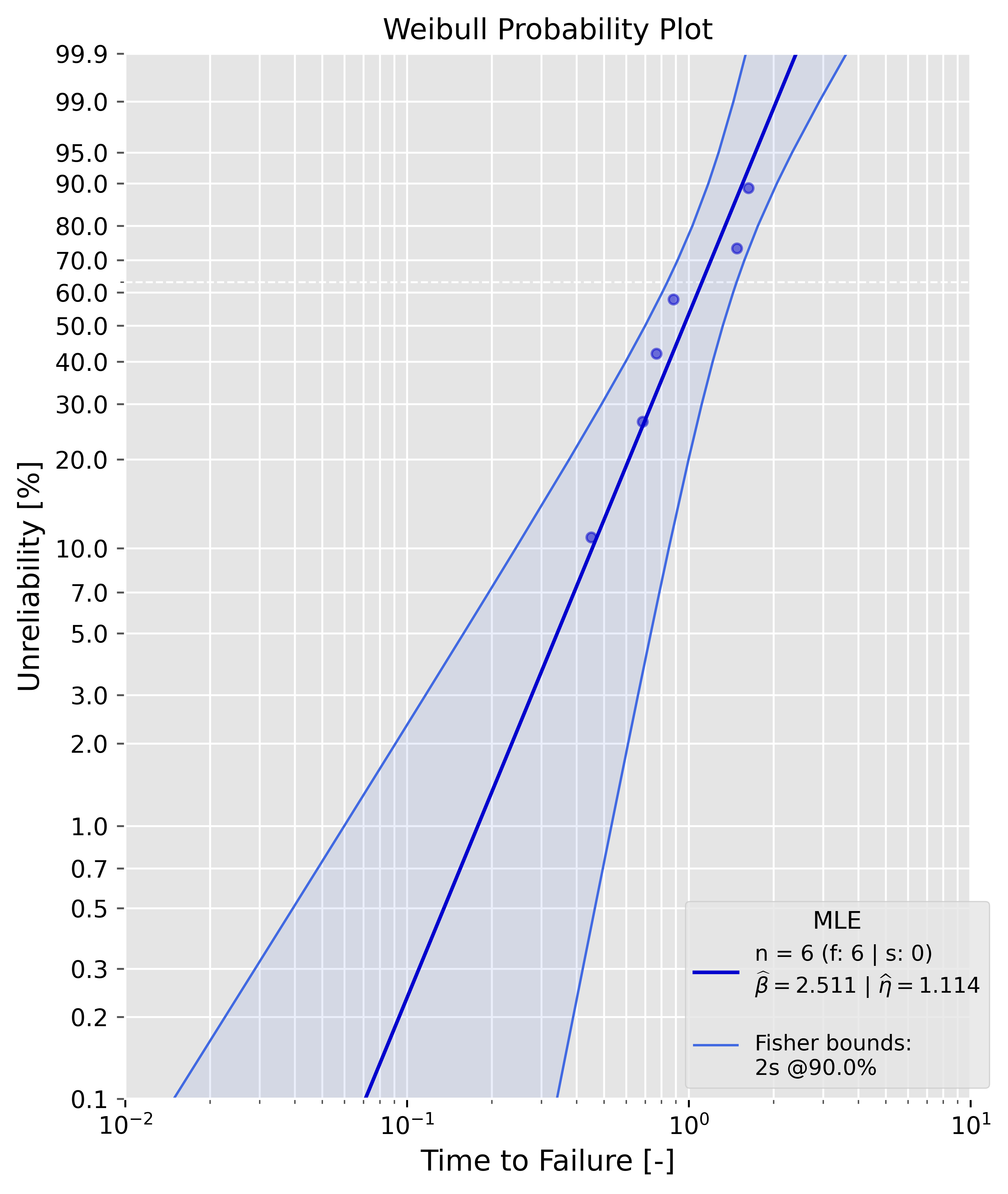
Maximum Likelihood Estimation (MLE)
Uncensored sample
Example:
failures = [0.4508831,  0.68564703, 0.76826143, 0.88231395, 1.48287253, 1.62876357]
prototype_a = Analysis(df=failures, bounds='fb',show=True)
prototype_a.mle()
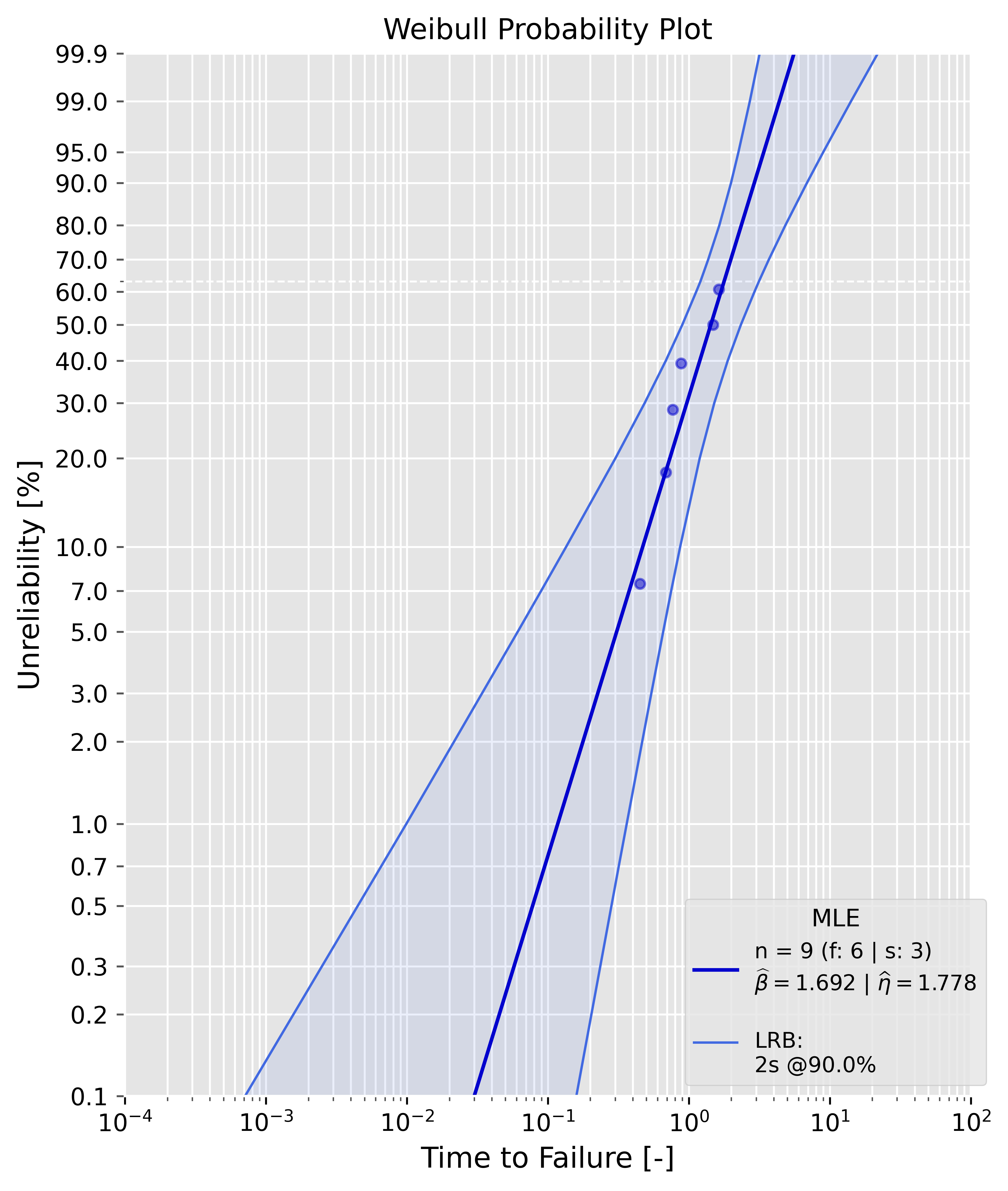
Censored sample
Example:
failures = [0.4508831,  0.68564703, 0.76826143, 0.88231395, 1.48287253, 1.62876357]
suspensions = [1.9, 2.0, 2.0]
prototype_a = Analysis(df=failures, ds=suspensions, bounds='lrb',show=True)
prototype_a.mle()
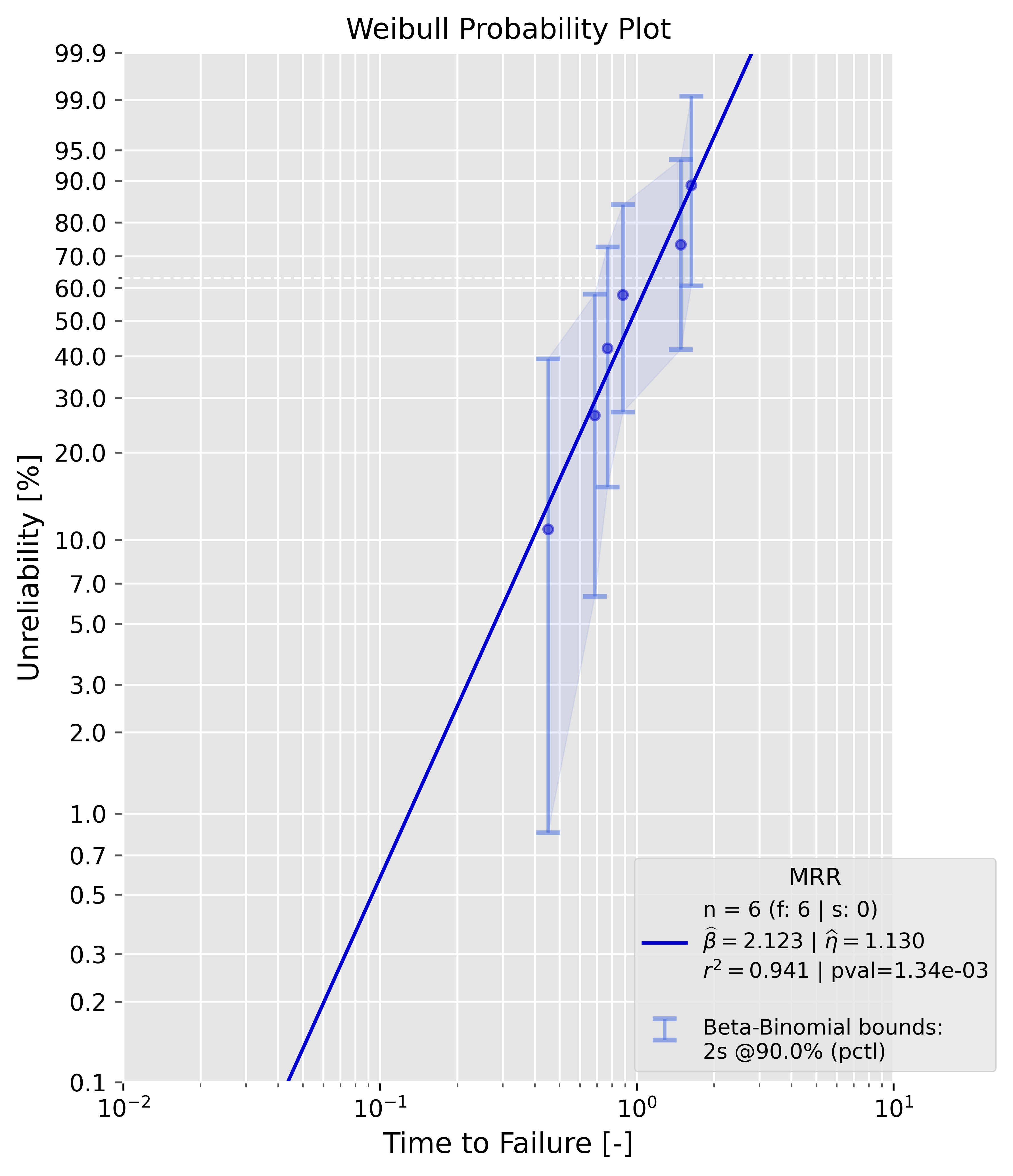
Median Rank Regression (MRR)
Uncensored sample
Example:
failures = [0.4508831,  0.68564703, 0.76826143, 0.88231395, 1.48287253, 1.62876357]
prototype_a = Analysis(df=failures, bounds='bbb',show=True)
prototype_a.mrr()
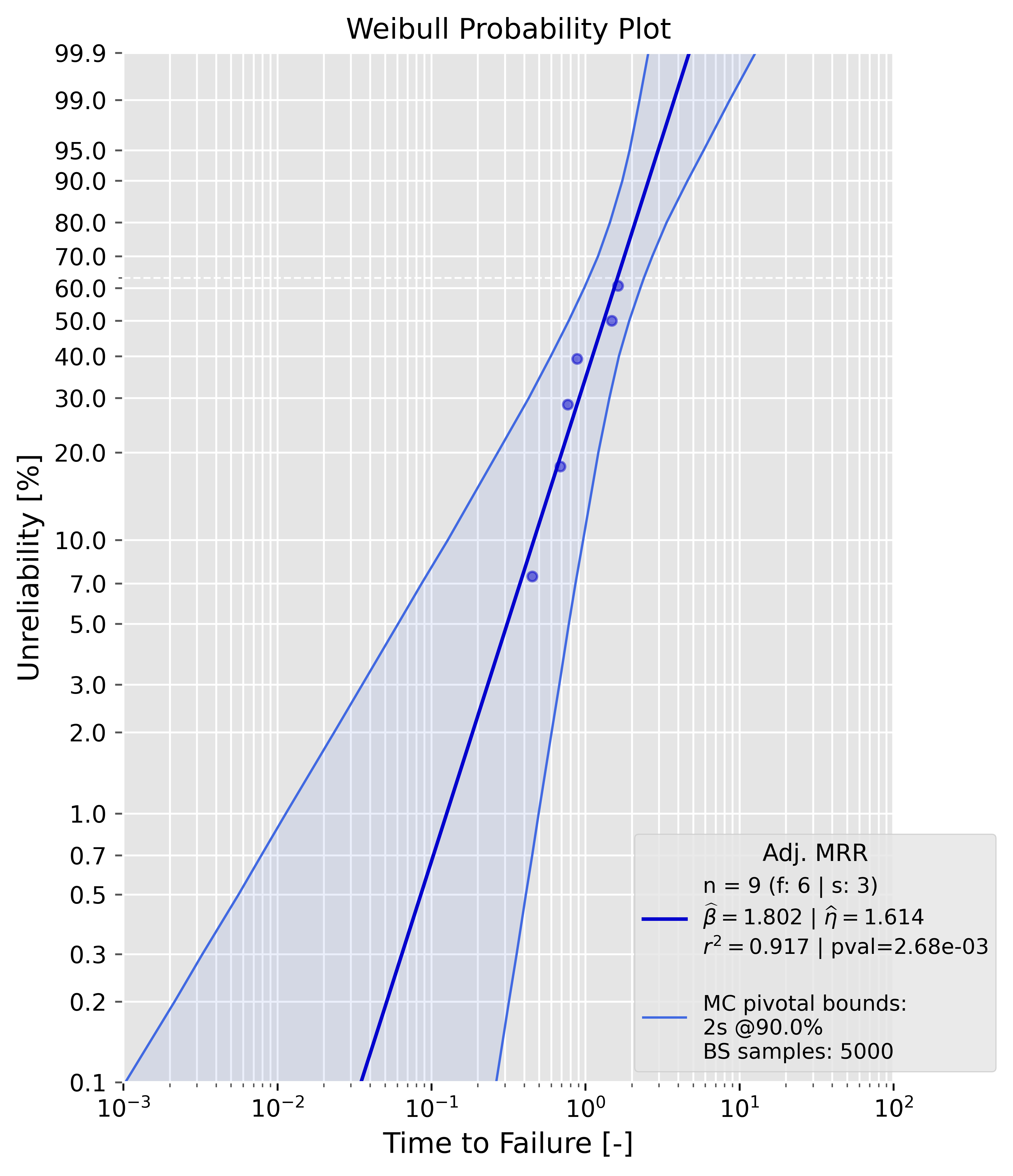
Censored sample
Example:
failures = [0.4508831,  0.68564703, 0.76826143, 0.88231395, 1.48287253, 1.62876357]
suspensions = [1.9, 2.0, 2.0]
prototype_a = Analysis(df=failures, ds=suspensions, bounds='mcpb',show=True)
prototype_a.mrr()
Bias-corrections
As already mentioned, only mle() support bias-corrections. The samples in these examples are drawn from a two-parameter Weibull distribution with a shape parameter of 2.0 and a scale parameter of 1.0.
Uncensored sample
It is appearent that the estimates of beta and eta are now closer to the ground truth values. The dotted grey line in the plot is the "biased" MLE line, the bia-corrected line is blue. The legend contains all needed information.
failures = [0.4508831,  0.68564703, 0.76826143, 0.88231395, 1.48287253, 1.62876357]
prototype_a = Analysis(df=failures, bounds='fb', show=True, bcm='c4')
prototype_a.mle()
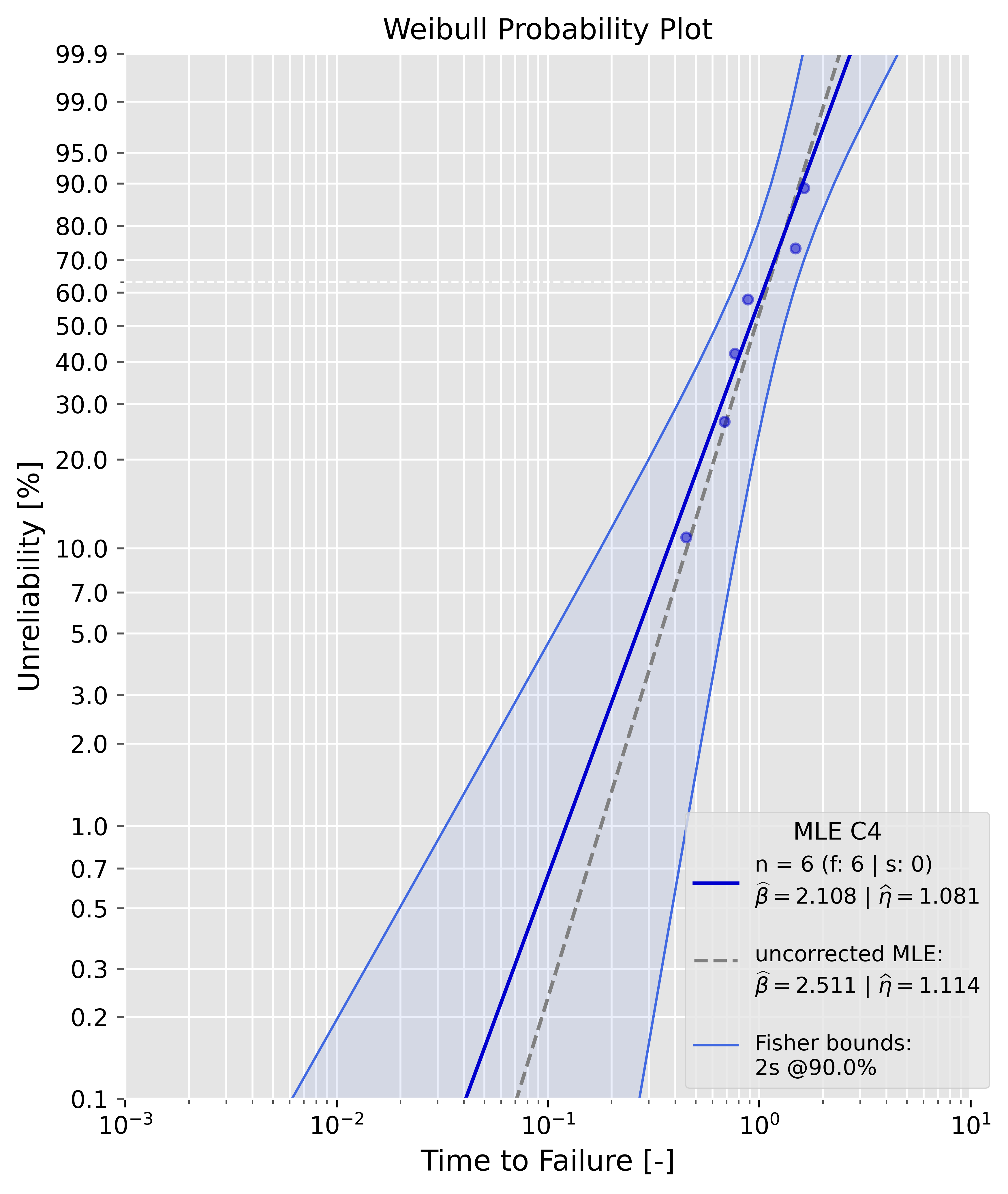
The estimates can for the Weibull parameters can be compared directly, since they are available as attributes
print(f'biased beta: {prototype_a.beta:4f} --> bias-corrected beta: {prototype_a.beta_c4:4f}')
>>> biased beta: 2.511134 --> bias-corrected beta: 2.108248
Censored sample
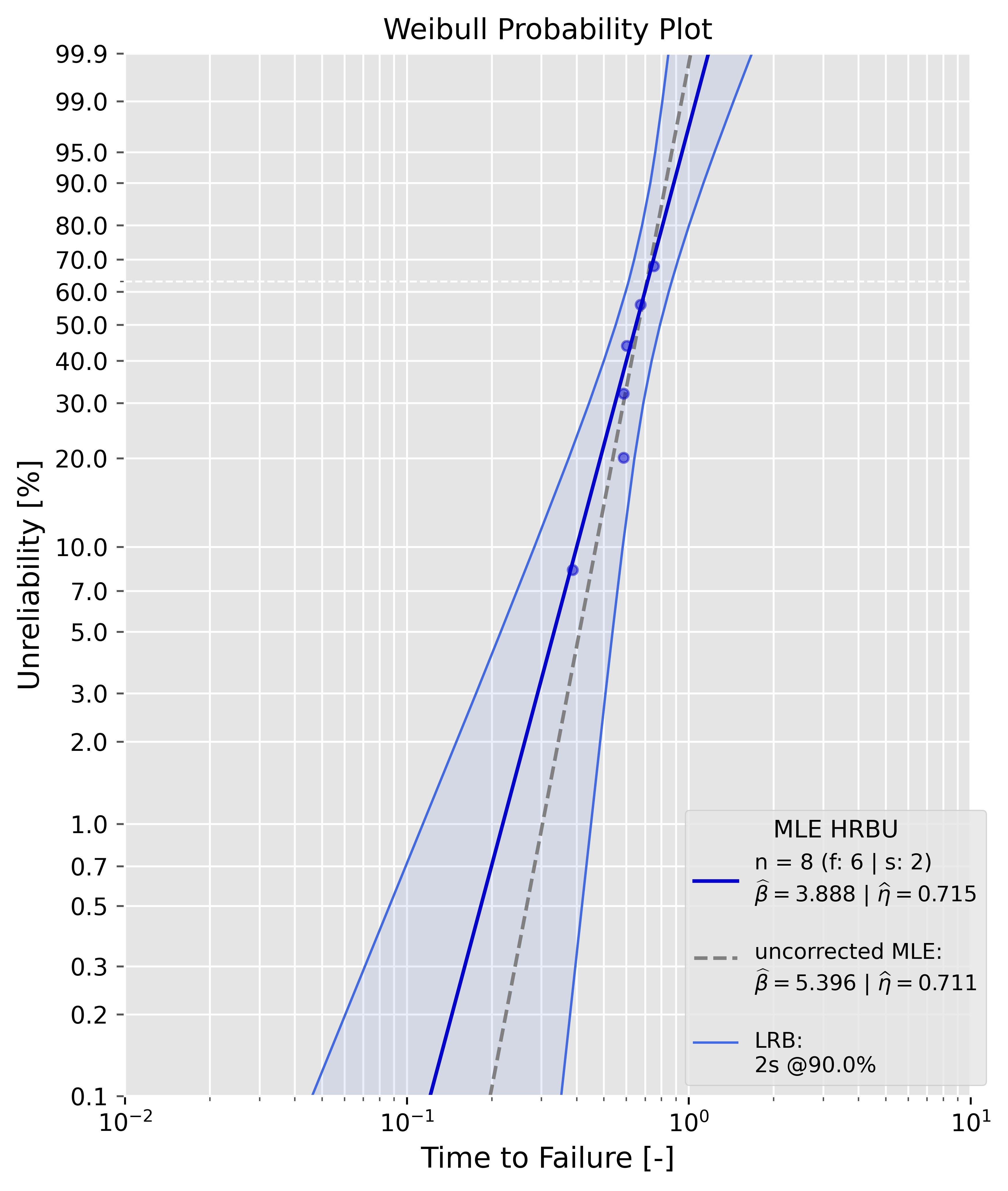
The data is type II right-censored.
failures = [0.38760099164906514, 0.5867052007217437, 0.5878056753744406, 0.602290402929083, 0.6754829518358306, 0.7520219855697948]
suspensions = [0.7520219855697948, 0.7520219855697948]
prototype_a = Analysis(df=failures, ds=suspensions, bounds='lrb', show=True, bcm='hrbu')
prototype_a.mle()
Modifying the Weibull plot
Axes labels and title
You can modify the axes label, plot title and the fontsize. Also, you can save the plot by setting save=True and path='your/own/directory/example.pdf'.
failures = [0.4508831,  0.68564703, 0.76826143, 0.88231395, 1.48287253, 1.62876357]
prototype_a = Analysis(df=failures, bounds='fb',show=True, plot_title='New Project', x_label='No. of Cycles', unit='10^3', y_label='Unreliability: 1-R', xy_fontsize=12, save=True, path=r'var/user/test.pdf')
prototype_a.mle()
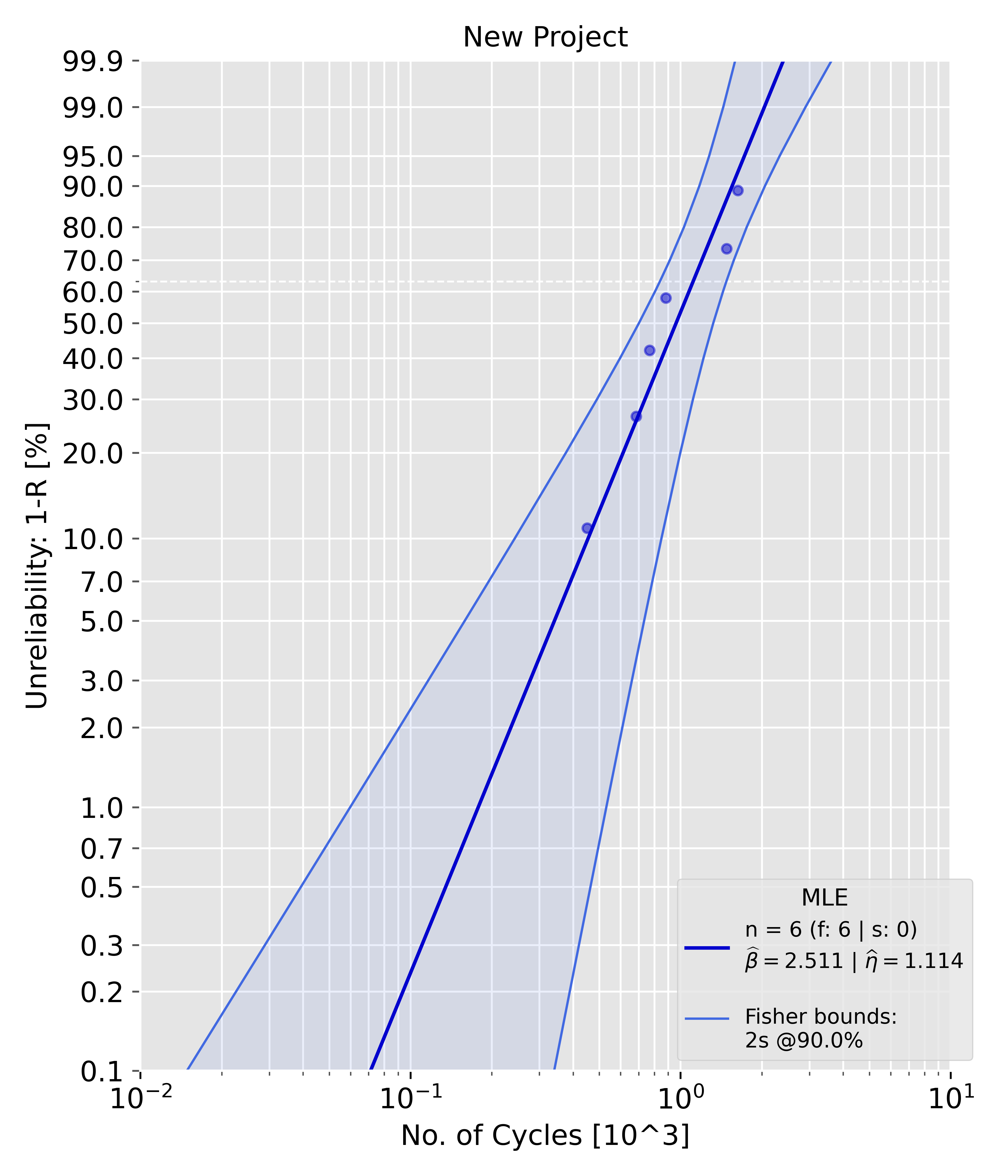
Figure size, plot legend and median rank markers
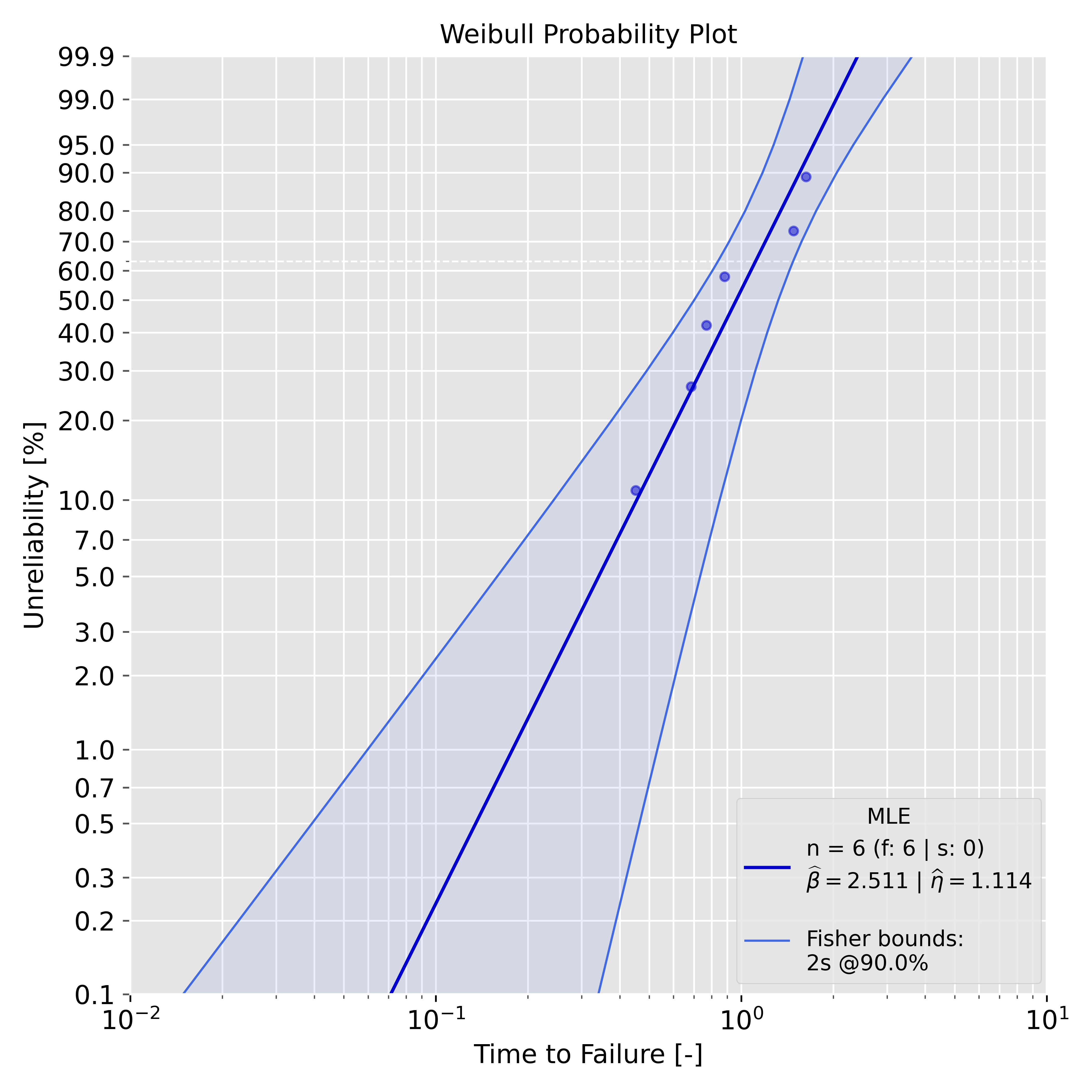
You can customize the fontsize that is being used in the plot legend. If you don't want a legend set show_legend=False. By default, the markers for the median ranks will be plotted. Set plot_ranks=False if you don't want median rank markers in your plot. The figure size can be modified with fig_size=(width, height). Width and height set the figure size in inches.
failures = [0.4508831,  0.68564703, 0.76826143, 0.88231395, 1.48287253, 1.62876357]
prototype_a = Analysis(df=failures, bounds='fb',show=True, show_legend=True, legend_fontsize=10, plot_ranks=False, fig_size=(7, 7))
prototype_a.mle()
Normal, LogNormal and Exponential
Set dist='normal', dist='lognormal' or dist='exponential' to fit that distribution instead of Weibull. bcm is not supported for these three; see the Distributions table above for which bounds each one accepts.
failures = [0.4508831,  0.68564703, 0.76826143, 0.88231395, 1.48287253, 1.62876357]

normal_fit = Analysis(df=failures, dist='normal', bounds='lrb', show=True)
normal_fit.mle()

lognormal_fit = Analysis(df=failures, dist='lognormal', bounds='fb', show=True)
lognormal_fit.mle()

exp_fit = Analysis(df=failures, dist='exponential', bounds='fb', show=True)
exp_fit.mle()
Exponential: exact chi-square bounds
dist='exponential' additionally supports bounds='chi2', an exact chi-square pivotal confidence interval (as opposed to the asymptotic Fisher bounds bounds='fb' also available for it).
failures = [0.4508831,  0.68564703, 0.76826143, 0.88231395, 1.48287253, 1.62876357]
exp_fit = Analysis(df=failures, dist='exponential', bounds='chi2', bounds_type='2s', show=True)
exp_fit.mle()
PlotAll
PlotAll plots class objects from Analysis in one figure. Currently, only data from mle() is supported.
Theoretically, you can plot as many objects as you like -> provide a list of colors (and, for mult_weibull()/mult_normal()/mult_lognormal()/mult_exponential(), optionally a matching list of linestyles) as a kwarg in PlotAll(objects, **kwargs).mult_weibull() / .contour_plot().
By default, predictr uses its own 6-color categorical palette. If you plot more than 6 datasets without passing your own color, the palette repeats, but the linestyle automatically advances (solid -> dashed -> dotted -> dash-dot) with every full pass through the palette, so up to 24 datasets stay visually distinguishable by color+shape before anything repeats outright.
Available methods:
| Methods | Description |
|---|---|
| mult_weibull() | Plots multiple Analysis class instances (dist='weibull') in one Weibull plot |
| mult_normal() | Plots multiple Analysis class instances (dist='normal') in one Normal probability plot |
| mult_lognormal() | Plots multiple Analysis class instances (dist='lognormal') in one LogNormal probability plot |
| mult_exponential() | Plots multiple Analysis class instances (dist='exponential') in one Exponential probability plot (drawn on Weibull paper, since Exponential is Weibull's beta=1 special case) |
| contour_plot() | Plots contour plots when likelihood ratio bounds are used in Analysis |
| weibull_pdf() | Plots one or more Weibull probability density functions. Axes are completely customizable. |
| simple_weibull() | Plots the Weibull probability plot for a given pair of beta and eta. If failures and/or suspensions are given, the median ranks are plotted as well. |
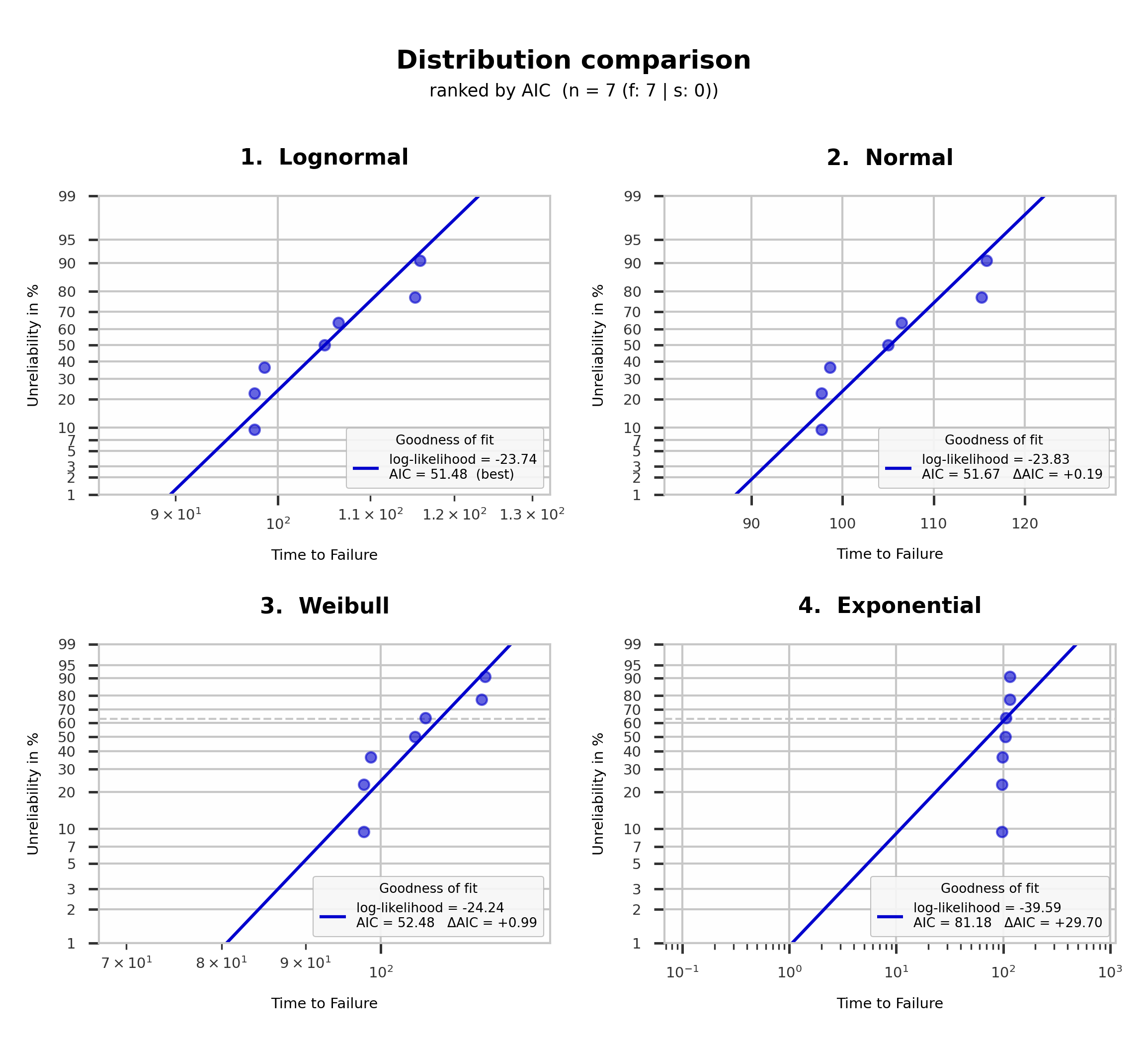
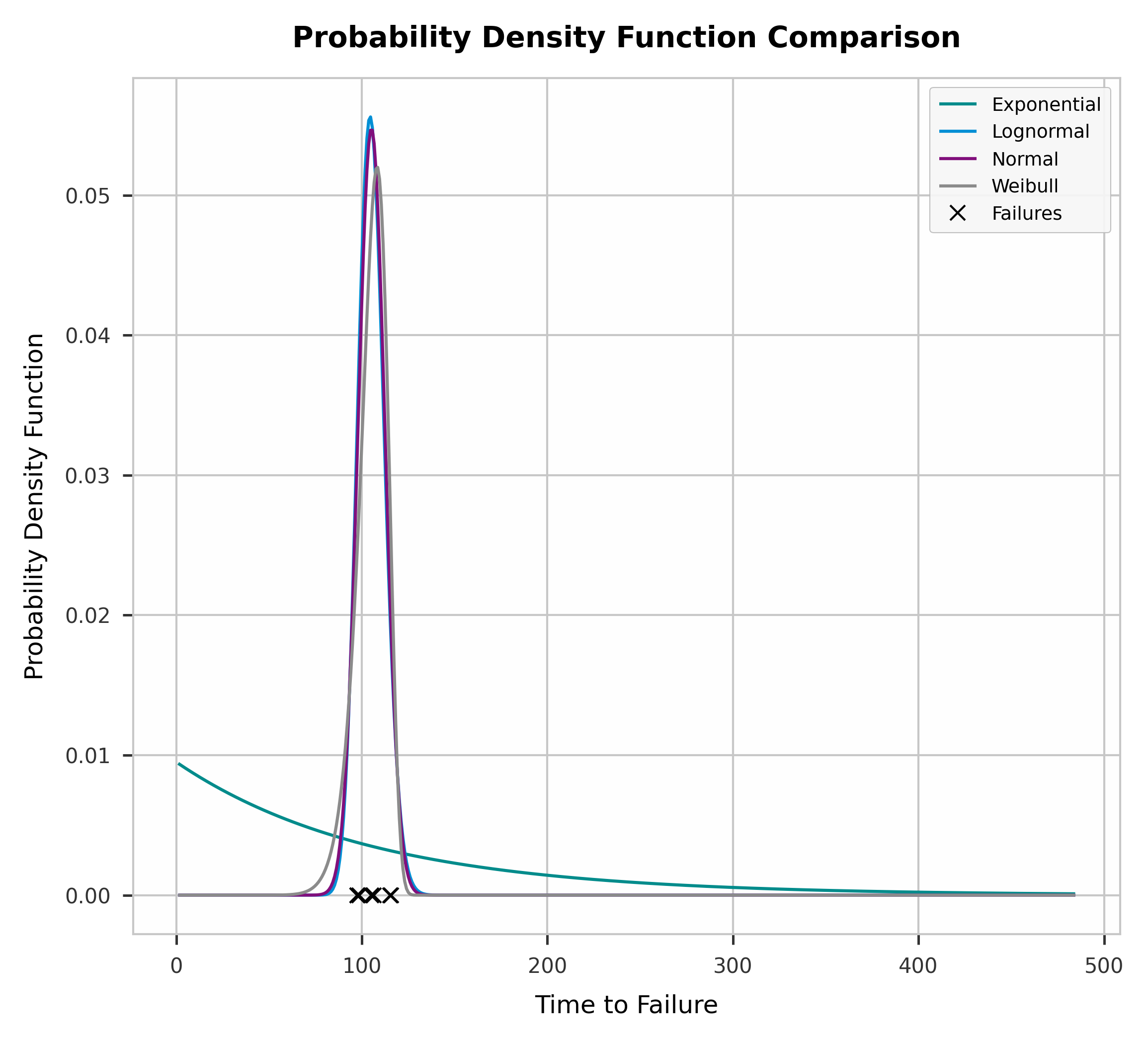
| compare() | Fits every distribution predictr supports to one dataset and plots a probability-plot grid ranked by AIC (or Anderson-Darling), optionally with a separate PDF comparison figure. |
Note: mult_weibull()/mult_normal()/mult_lognormal()/mult_exponential() each only accept Analysis objects that share their own dist - a ValueError is raised if you mix, e.g., a dist='weibull' object into mult_normal(). To compare fits across distributions, use compare() instead.
Default Arguments of each method
Most of the arguments are either self explanatory or already defined in default arguments and values
| Methods | Default arguments |
|---|---|
| mult_weibull() | x_label='Time To Failure', y_label='Unreliability', plot_title='Weibull Probability Plot', xy_fontsize=12, plot_title_fontsize=14, legend_fontsize=9, fig_size=(6, 7), x_bounds=None, plot_ranks=True, save=False, color=None, linestyle=None, y_min=0.01, y_max=0.99, show=True, **kwargs |
| mult_normal() | x_label='Time To Failure', y_label='Unreliability', plot_title='Normal Probability Plot', xy_fontsize=12, plot_title_fontsize=14, legend_fontsize=9, fig_size=(6, 7), x_bounds=None, plot_ranks=True, save=False, color=None, linestyle=None, y_min=0.01, y_max=0.99, show=True, **kwargs |
| mult_lognormal() | x_label='Time To Failure', y_label='Unreliability', plot_title='LogNormal Probability Plot', xy_fontsize=12, plot_title_fontsize=14, legend_fontsize=9, fig_size=(6, 7), x_bounds=None, plot_ranks=True, save=False, color=None, linestyle=None, y_min=0.01, y_max=0.99, show=True, **kwargs |
| mult_exponential() | x_label='Time To Failure', y_label='Unreliability', plot_title='Exponential Probability Plot', xy_fontsize=12, plot_title_fontsize=14, legend_fontsize=9, fig_size=(6, 7), x_bounds=None, plot_ranks=True, save=False, color=None, linestyle=None, y_min=0.01, y_max=0.99, show=True, **kwargs |
| contour_plot() | show=True, style='hull', show_weibull=False, show_legend=True, color=None, x_label=r'$\widehat\beta$', y_label=None, plot_title='Contour Plot', xy_fontsize=12, plot_title_fontsize=14, legend_fontsize=9, fig_size=(6.4, 4.8), save=False, scale_mode='auto', log_ratio_threshold=10, cl_set=None, curve_fill=True, fill_alpha=0.25, **kwargs |
| weibull_pdf() | beta=None, eta=None, linestyle=['-', '--', ':', '-.'], labels=None, x_label=None, y_label=None, xy_fontsize=12, tick_fontsize=10, legend_fontsize=9, plot_title='Weibull PDF', plot_title_fontsize=14, x_bounds=None, fig_size=None, color=None, save=False, plot_style='predictr', **kwargs |
| simple_weibull() | beta, eta, unit='-', x_label = 'Time to Failure', y_label = 'Unreliability', xy_fontsize=12, tick_fontsize=10, plot_title_fontsize=14, plot_title='Weibull Probability Plot', fig_size=(6, 7), show_legend=True, legend_fontsize=9, save=False, df=None, ds=None, **kwargs |
| compare() | df, ds=None, bounds=None, bounds_type='2s', cl=0.9, x_label='Time to Failure', y_label='Unreliability', fig_size=(7.7, 7), y_min=0.01, y_max=0.99, plot_ranks=False, criteria='aic', plot_pdf=True, pdf_xy_fontsize=12, pdf_tick_fontsize=10, pdf_legend_fontsize=9, pdf_plot_title_fontsize=14, show=True, save=False, plot_style='predictr', **kwargs |
| Parameter(s) | default value | type | description |
|---|---|---|---|
| df | None | list of floats | List of failures |
| ds | None | list of floats | List of suspensions (right-censored only) |
| plot_style | 'predictr' | str | Choose a style according to your needs. 'predictr' is predictr's own built-in style (no setup required); see matplotlib style references for other available styles. Only weibull_pdf() exposes this as its own argument - mult_weibull()/mult_normal()/mult_lognormal()/mult_exponential()/contour_plot()/simple_weibull() inherit it from the Analysis object(s) passed in. |
| unit | '-' | str | Unit of failures and suspensions, e.g. 's', 'ms', 'no. of cycle' etc. |
| x_label | depends on method | string | Label for the x-axis |
| y_label | depends on method | string | Label for the y-axis |
| labels | string | List containing the labels for the plot legend in weibull_pdf() | |
| xy_fontsize | 12 | float | Fontsize for the axes label |
| tick_fontsize | 10 | float | Fontsize for the tick labels (the numbers on the axes). weibull_pdf() and simple_weibull() only. |
| legend_fontsize | 9 | float | Fontsize for the legend |
| plot_title | 'Weibull Probability Plot' | string | Title for the plot |
| plot_title_fontsize | 14 | float | Fontsize of the plot title |
| fig_size | (6, 7) | tuple of floats | Sets figure width and height in inches: (width, height) |
| save | False | boolean | If True, the plot is saved according to the path (kwargs) |
| style | 'hull' | string | contour_plot() only. Defines how each dataset's confidence region is drawn: 'hull' (convex hull outline, optionally filled) or 'scatter' (raw sampled points) |
| show_weibull | False | boolean | contour_plot() only. If True, returns the matplotlib Figure object instead of just showing/saving it |
| scale_mode | 'auto' | string | contour_plot() only. Scaling of the eta (y) axis: 'auto' switches to a log scale when eta spans more than log_ratio_threshold across datasets, 'linear'/'log' force the respective scale |
| log_ratio_threshold | 10 | float | contour_plot() only. max(eta)/min(eta) ratio above which scale_mode='auto' switches to a log scale |
| cl_set | None | list of floats | contour_plot() only. Confidence levels to draw per dataset, e.g. [0.95, 0.9, 0.8]. If None, each object's own cl attribute is used (one curve per object, as before) |
| curve_fill | True | boolean | contour_plot() only. If True, the area enclosed by each confidence-region curve is filled |
| fill_alpha | 0.25 | float | contour_plot() only. Opacity used for curve_fill |
| plot_ranks | True | boolean | If True, median ranks will be plotted. |
| show_legend | True | boolean | If True, the legend will be plotted |
| weibull_pdf: beta, eta | None, None | list of floats or None | Attributes from Analysis object. Pairs of beta and eta values to be plotted. Each parameter pair must have the same index value. |
| linestyle | ['-', '--', ':', '-.'] | list of strings | weibull_pdf(): required, must match the length of beta/eta. mult_weibull()/mult_normal()/mult_lognormal()/mult_exponential(): optional, must match the number of objects if given. |
| color | None | list of strings | List containing the colors for the plotted lines/datasets. If not given, predictr's built-in 6-color palette is used (see note above the "Available methods" table for what happens with more than 6 datasets). If given, length must match the beta/eta length (weibull_pdf()) or the number of Analysis objects (mult_weibull()/mult_normal()/mult_lognormal()/mult_exponential(), contour_plot()). |
| y_min, y_max | 0.01, 0.99 | float | mult_weibull()/mult_normal()/mult_lognormal()/mult_exponential() only. Y-axis limits (unreliability, as a fraction). Must satisfy 0 < y_min < y_max < 1. |
| x_bounds | list of floats | Sets x-axis boundaries: [start, stop] or [start, end, steps inbetween], respectively. | |
| simple_weibull:beta, eta | float | Weibull parameter pair which will be plotted | |
| criteria | 'aic' | string | compare() only. Ranks/labels the panels by 'aic' or 'ad' (Anderson-Darling) |
| plot_pdf | True | boolean | compare() only. If True, also produces a separate figure overlaying every fitted distribution's PDF |
| pdf_xy_fontsize, pdf_tick_fontsize, pdf_legend_fontsize, pdf_plot_title_fontsize | 12, 10, 9, 14 | float | compare() only. Font sizes for the separate PDF figure (only used when plot_pdf=True) |
| kwarg: path | string | Path defines the directory and format of the figure E.g. r'var/user/.../test.pdf' |
mult_weibull()
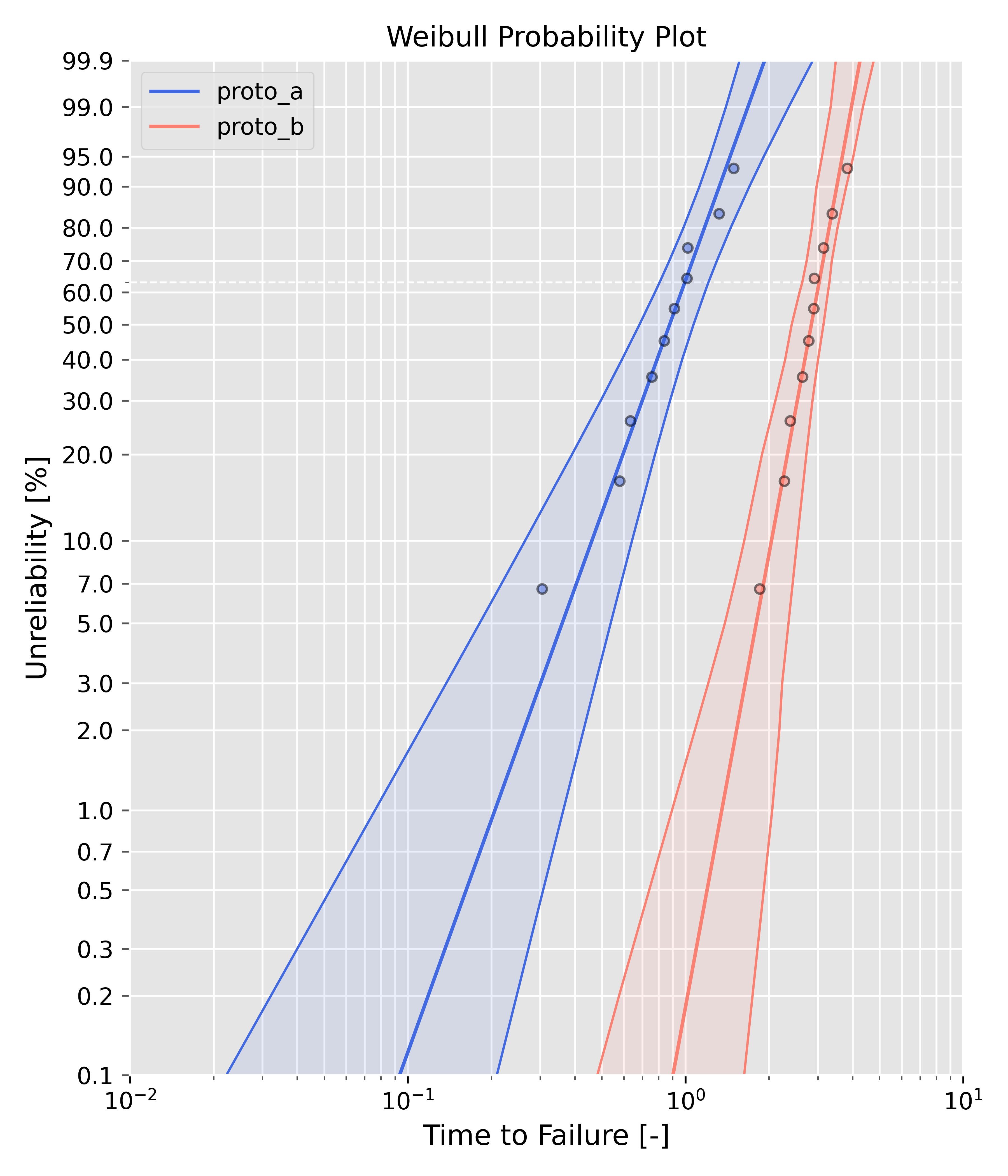
Both with two-sided bounds - default colors
from predictr import Analysis, PlotAll

# Create new objects, e.g. name them prototype_a and prototype_b
failures_a = [0.30481336314657737, 0.5793918872111126, 0.633217732127894, 0.7576700925659532,
              0.8394342818048925, 0.9118100898948334, 1.0110147142055477, 1.0180126386295232,
              1.3201853093496474, 1.492172669340363]
prototype_a = Analysis(df=failures_a, bounds='lrb', bounds_type='2s')
prototype_a.mle()

failures_b = [1.8506941739639076, 2.2685555679846954, 2.380993183650987, 2.642404955035375,
              2.777082863078587, 2.89527127055147, 2.9099992138728927, 3.1425481097241,
              3.3758727398694406, 3.8274990886889997]
prototype_b = Analysis(df=failures_b, bounds='pbb', bounds_type='2s')
prototype_b.mle()

# Create dictionary with Analysis objects
# Keys will be used in figure legend. Name them as you please.
objects = {'proto_a': prototype_a, 'proto_b': prototype_b}

# Use mult_weibull() method
PlotAll(objects).mult_weibull()
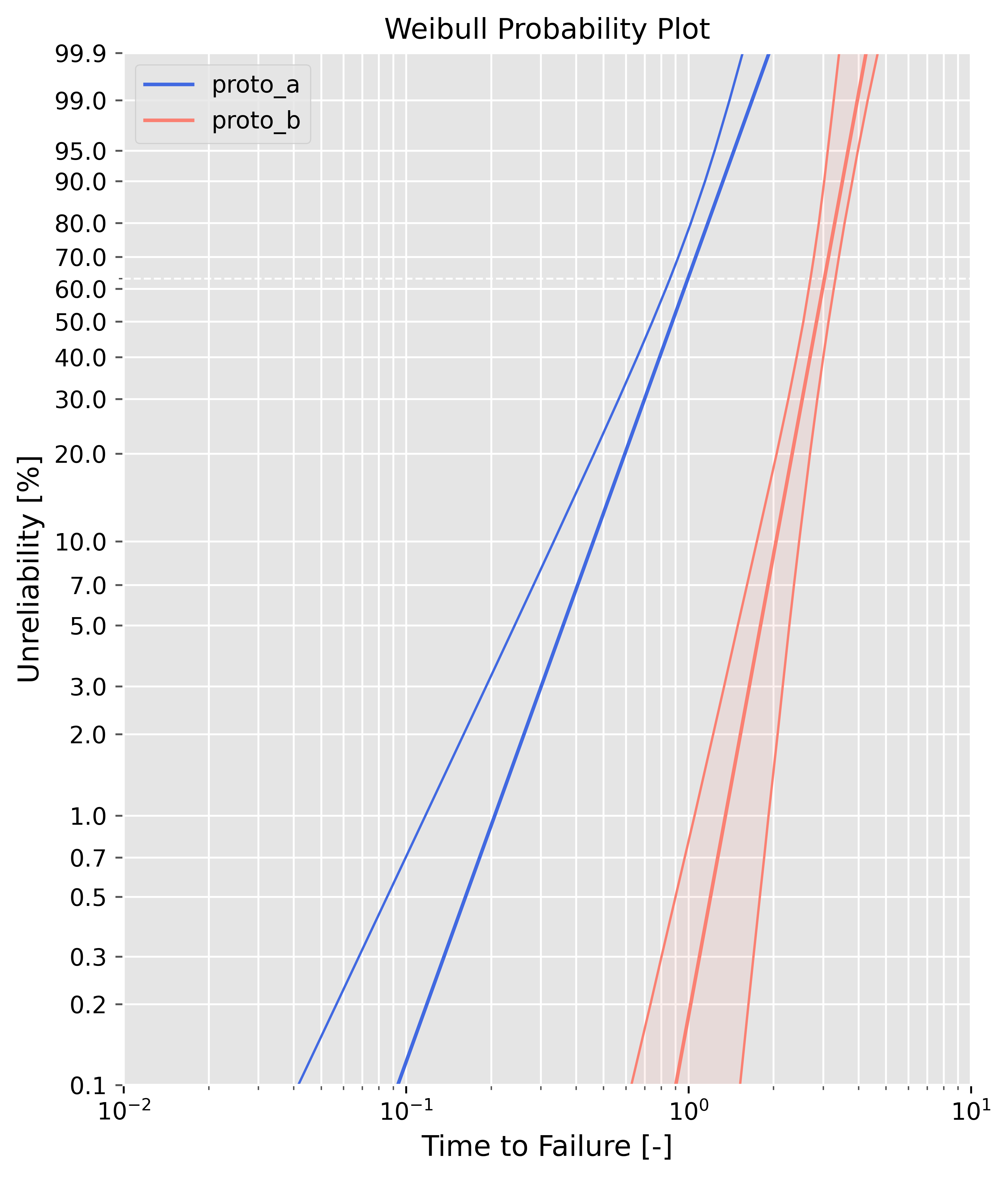
One object with a one-sided lower bound, the other one has two-sided bounds - default colors
You can plot every bounds_type ('2s', '1sl', '1su') and combine them.
from predictr import Analysis, PlotAll

# Create new objects, e.g. name them prototype_a and prototype_b
failures_a = [0.30481336314657737, 0.5793918872111126, 0.633217732127894, 0.7576700925659532,
              0.8394342818048925, 0.9118100898948334, 1.0110147142055477, 1.0180126386295232,
              1.3201853093496474, 1.492172669340363]
prototype_a = Analysis(df=failures_a, bounds='fb', bounds_type='1sl')
prototype_a.mle()

failures_b = [1.8506941739639076, 2.2685555679846954, 2.380993183650987, 2.642404955035375,
              2.777082863078587, 2.89527127055147, 2.9099992138728927, 3.1425481097241,
              3.3758727398694406, 3.8274990886889997]
prototype_b = Analysis(df=failures_b, bounds='npbb', bounds_type='2s')
prototype_b.mle()

# Create dictionary with Analysis objects
# Keys will be used in figure legend. Name them as you please.
objects = {'proto_a': prototype_a, 'proto_b': prototype_b}

# Use mult_weibull() method
# Set plot_ranks=True, if you want to plot the median rank markers
PlotAll(objects).mult_weibull(plot_ranks=False)
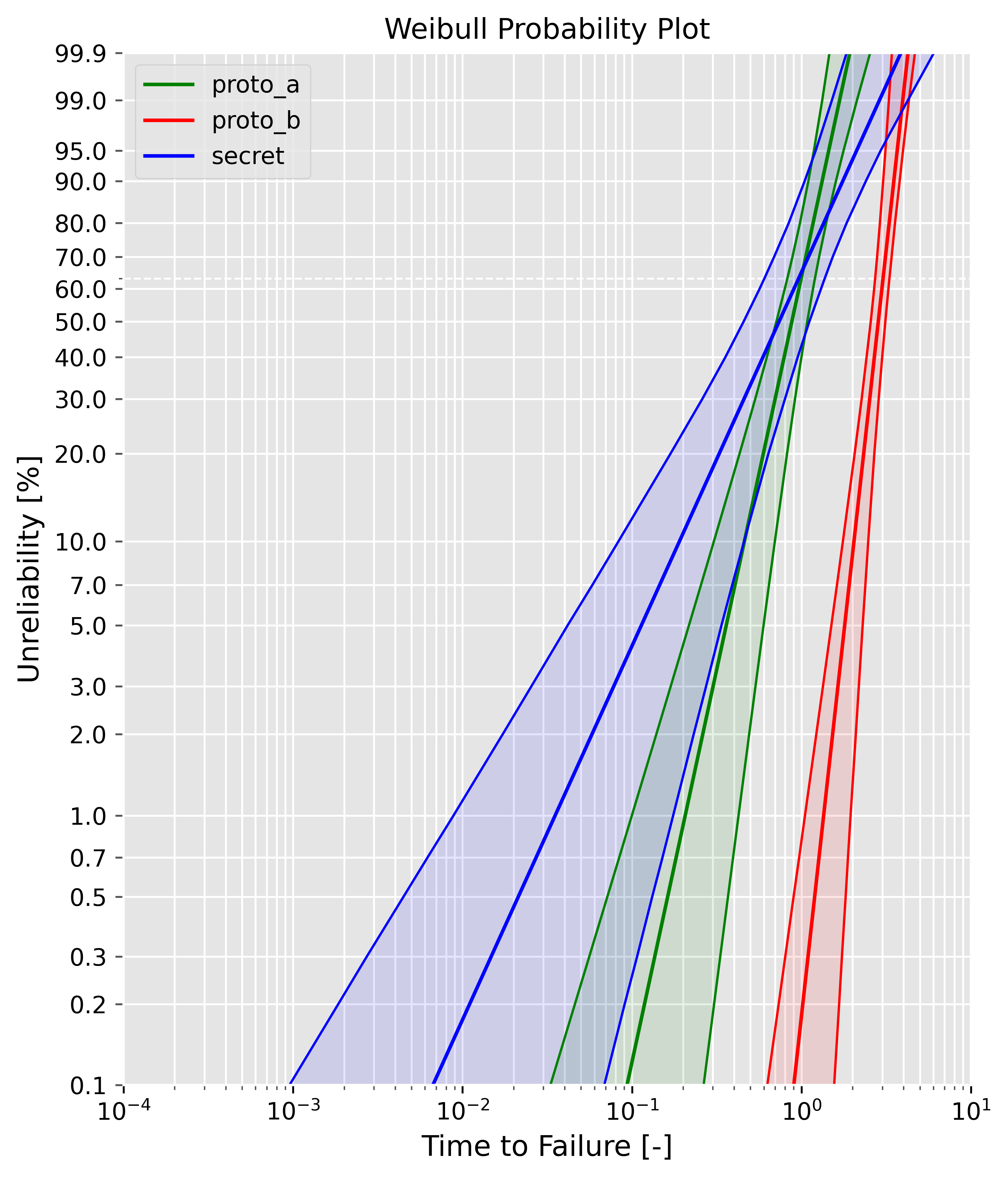
Three objects - custom colors
from predictr import Analysis, PlotAll

# Create new objects
failures_a = [0.30481336314657737, 0.5793918872111126, 0.633217732127894, 0.7576700925659532,
              0.8394342818048925, 0.9118100898948334, 1.0110147142055477, 1.0180126386295232,
              1.3201853093496474, 1.492172669340363]
prototype_a = Analysis(df=failures_a, bounds='fb', bounds_type='2s')
prototype_a.mle()

failures_b = [1.8506941739639076, 2.2685555679846954, 2.380993183650987, 2.642404955035375,
              2.777082863078587, 2.89527127055147, 2.9099992138728927, 3.1425481097241,
              3.3758727398694406, 3.8274990886889997]
prototype_b = Analysis(df=failures_b, bounds='npbb', bounds_type='2s')
prototype_b.mle()

failures_c = [0.04675399107295282, 0.31260891592041457, 0.32121232576015757, 0.6013488316204837,
              0.7755159796641791, 0.8994041575114923, 0.956417788622185, 1.1967354178170764,
              1.6115311492838604, 2.1120891587523793]
prototype_c = Analysis(df=failures_c, bounds='pbb', bounds_type='2s')
prototype_c.mle()

objects = {'proto_a': prototype_a, 'proto_b': prototype_b, 'secret': prototype_c}
# Create list with custom colors and pass to the instance method
colors = ['green', 'red', 'blue']
PlotAll(objects).mult_weibull(plot_ranks=False, color=colors)
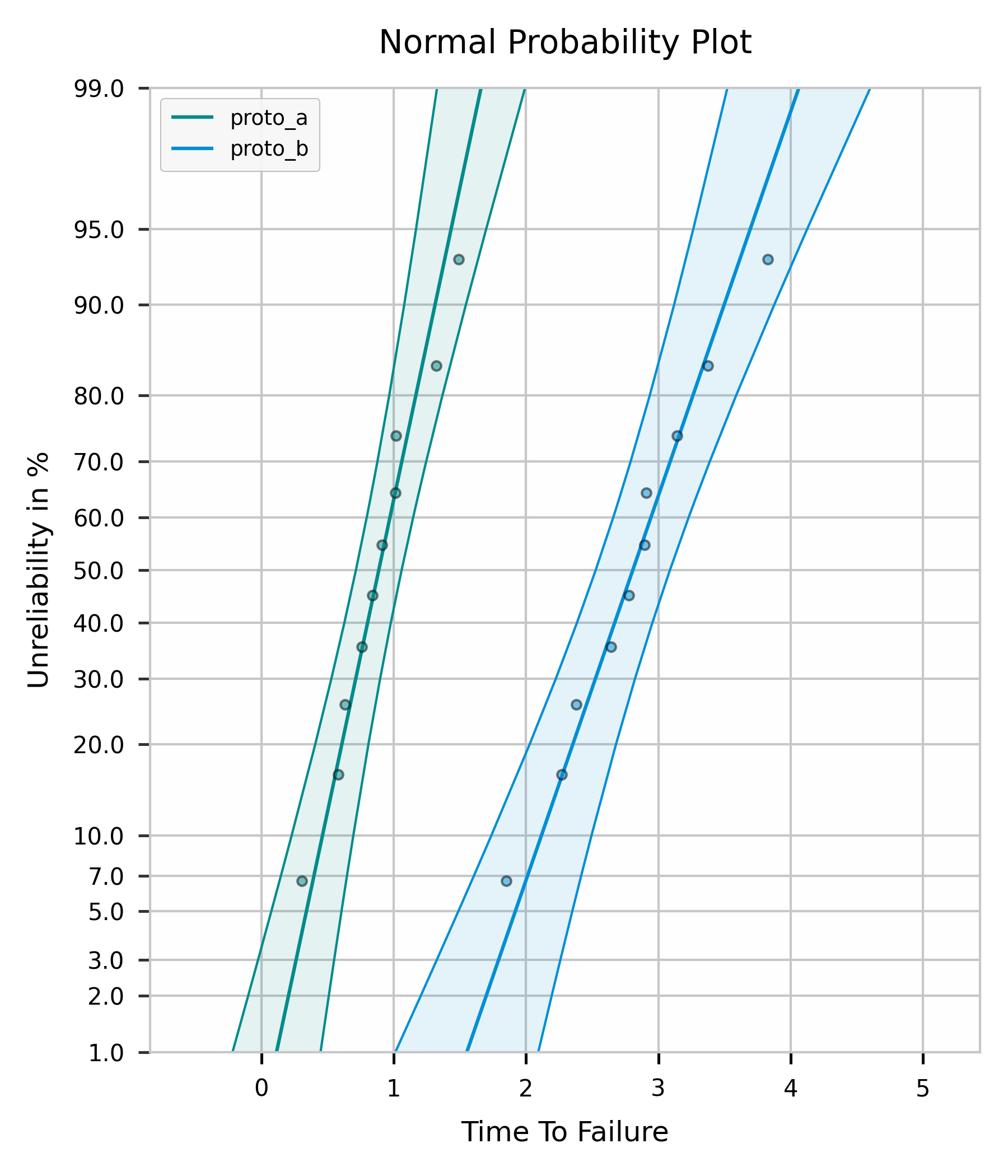
mult_normal() / mult_lognormal() / mult_exponential()
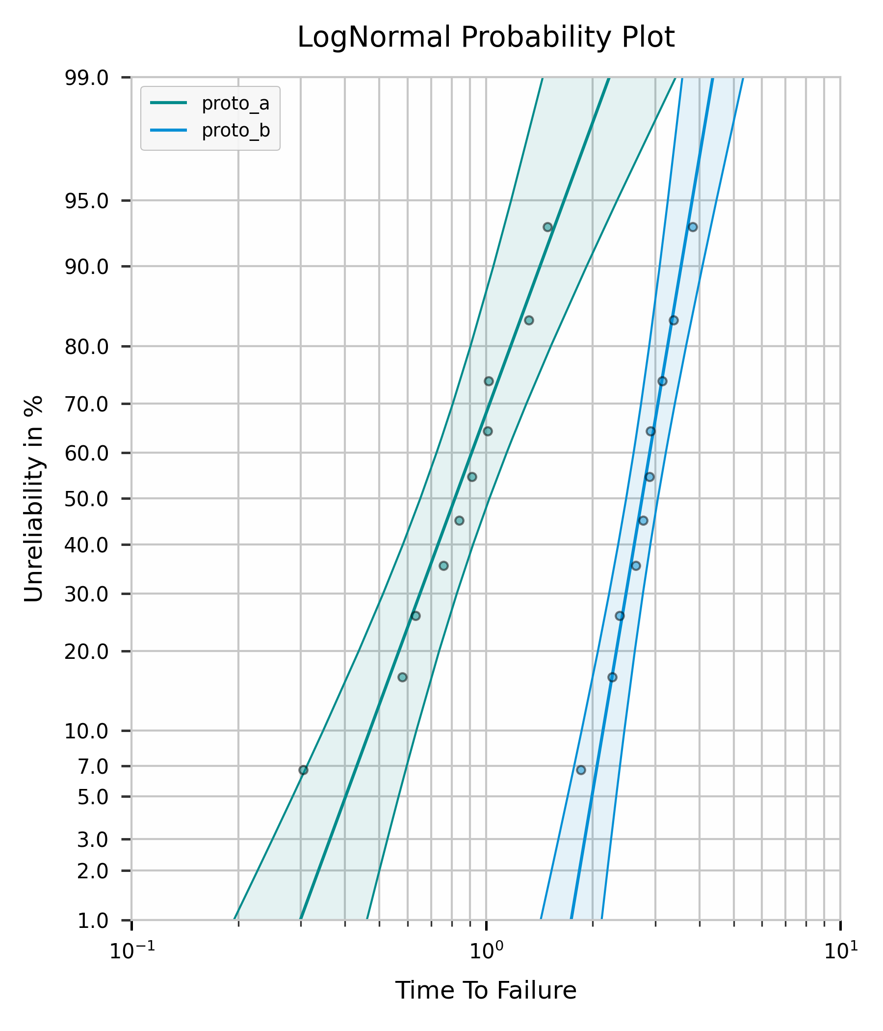
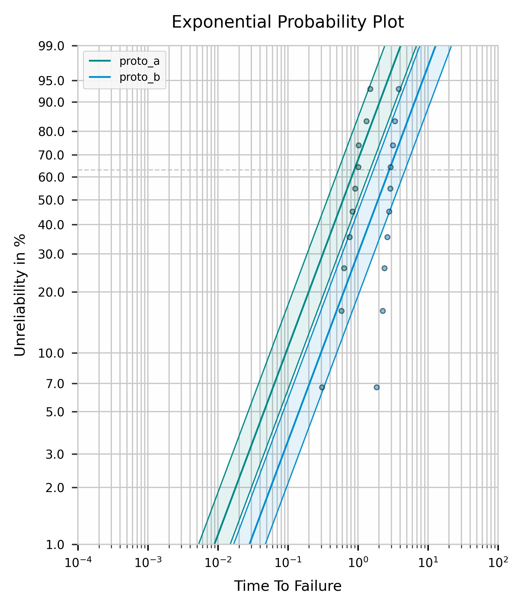
Just like mult_weibull(), but for dist='normal'/'lognormal'/'exponential' objects respectively - each draws all given Analysis instances on that distribution's own probability paper. All objects passed to one call must share the same dist; mixing distributions raises a ValueError (use compare() if you want to compare across distributions instead).
from predictr import Analysis, PlotAll

failures_a = [0.30481336314657737, 0.5793918872111126, 0.633217732127894, 0.7576700925659532,
              0.8394342818048925, 0.9118100898948334, 1.0110147142055477, 1.0180126386295232,
              1.3201853093496474, 1.492172669340363]
prototype_a = Analysis(df=failures_a, dist='normal', bounds='fb', bounds_type='2s')
prototype_a.mle()

failures_b = [1.8506941739639076, 2.2685555679846954, 2.380993183650987, 2.642404955035375,
              2.777082863078587, 2.89527127055147, 2.9099992138728927, 3.1425481097241,
              3.3758727398694406, 3.8274990886889997]
prototype_b = Analysis(df=failures_b, dist='normal', bounds='fb', bounds_type='2s')
prototype_b.mle()

objects = {'proto_a': prototype_a, 'proto_b': prototype_b}
PlotAll(objects).mult_normal()
The same objects fitted with dist='lognormal' instead, plotted with mult_lognormal():
...and with dist='exponential', plotted with mult_exponential() (drawn on Weibull paper - see Distributions for why):
contour_plot()
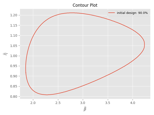
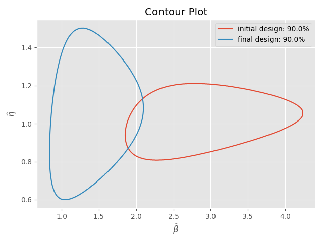
contour_plot() only works for likelihood ratio bounds. Hence, you have to use bounds='lrb' in the Analysis class. This method supports all bounds types and all confidence levels. You can pass as many objects as you want to.
Each dataset's confidence region is drawn as a filled hull by default (curve_fill=True), with its confidence level labeled directly on the curve and its point estimate marked as a dot - see the "Default Arguments of each method" and parameter table above for style, cl_set, curve_fill, scale_mode and log_ratio_threshold.
Plot a single Analysis object
from predictr import Analysis, PlotAll

# Create new objects
failures_a = [0.30481336314657737, 0.5793918872111126, 0.633217732127894, 0.7576700925659532,
              0.8394342818048925, 0.9118100898948334, 1.0110147142055477, 1.0180126386295232,
              1.3201853093496474, 1.492172669340363]
prototype_a = Analysis(df=failures_a, bounds='lrb', bounds_type='2s')
prototype_a.mle()

objects = {'initial design': prototype_a}
PlotAll(objects).contour_plot()
Plot a multiple Analysis objects
failures_a = [0.30481336314657737, 0.5793918872111126, 0.633217732127894, 0.7576700925659532,
              0.8394342818048925, 0.9118100898948334, 1.0110147142055477, 1.0180126386295232,
              1.3201853093496474, 1.492172669340363]
prototype_a = Analysis(df=failures_a, bounds='lrb', bounds_type='2s')
prototype_a.mle()

failures_c = [0.04675399107295282, 0.31260891592041457, 0.32121232576015757, 0.6013488316204837,
              0.7755159796641791, 0.8994041575114923, 0.956417788622185, 1.1967354178170764,
              1.6115311492838604, 2.1120891587523793]
prototype_c = Analysis(df=failures_c, bounds='lrb', bcm = 'hrbu', bounds_type='2s')
prototype_c.mle()

# Create dictionary with Analysis objects
# Keys will be used in figure legend. Name them as you please.
objects = {'initial design': prototype_a, 'final design': prototype_c}
PlotAll(objects).contour_plot()
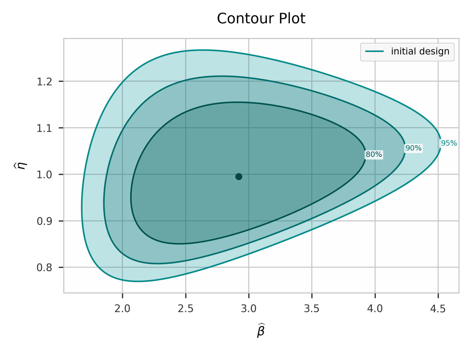
Multiple confidence levels for one object (cl_set)
Instead of plotting each object's own cl once, pass cl_set to draw several confidence-level curves per dataset, e.g. to compare 80%, 90% and 95% confidence regions at a glance.
failures_a = [0.30481336314657737, 0.5793918872111126, 0.633217732127894, 0.7576700925659532,
              0.8394342818048925, 0.9118100898948334, 1.0110147142055477, 1.0180126386295232,
              1.3201853093496474, 1.492172669340363]
prototype_a = Analysis(df=failures_a, bounds='lrb', bounds_type='2s')
prototype_a.mle()

objects = {'initial design': prototype_a}
PlotAll(objects).contour_plot(cl_set=[0.8, 0.9, 0.95])
Normal and LogNormal fits
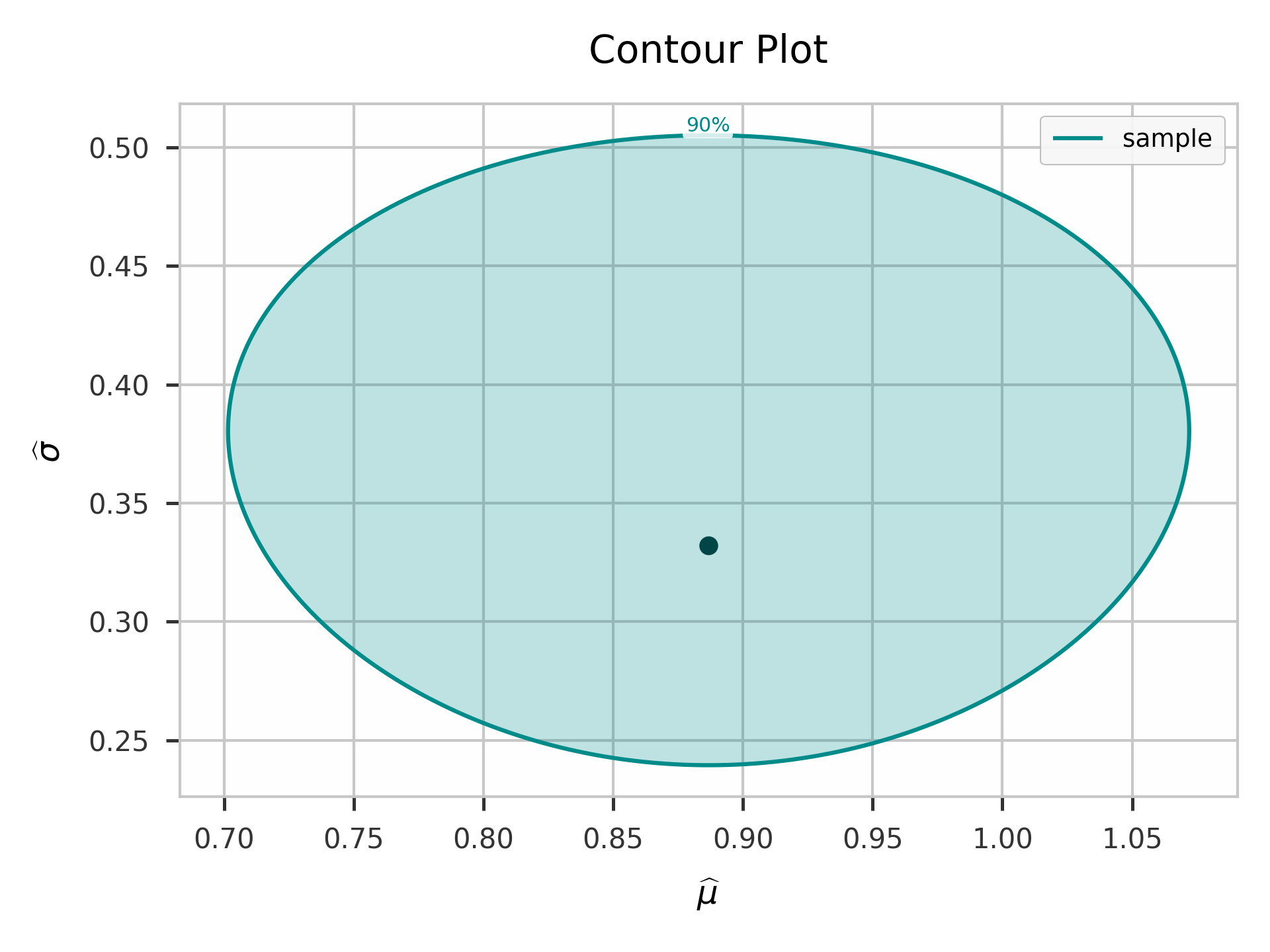
contour_plot() also works for dist='normal'/'lognormal' objects fitted with bounds='lrb', with axis labels matching each distribution's own parameters. Objects with different dist can't be mixed on one contour_plot() call - they don't share the same axes meaning.
from predictr import Analysis, PlotAll

failures = [0.30481336314657737, 0.5793918872111126, 0.633217732127894, 0.7576700925659532,
            0.8394342818048925, 0.9118100898948334, 1.0110147142055477, 1.0180126386295232,
            1.3201853093496474, 1.492172669340363]

normal_a = Analysis(df=failures, dist='normal', bounds='lrb', bounds_type='2s')
normal_a.mle()

objects = {'sample': normal_a}
PlotAll(objects).contour_plot()
Note: contour_plot() is not available for dist='exponential', since it has only one parameter (no likelihood-ratio contour to draw) and uses bounds='chi2'/'fb' instead - see Distributions.
weibull_pdf()
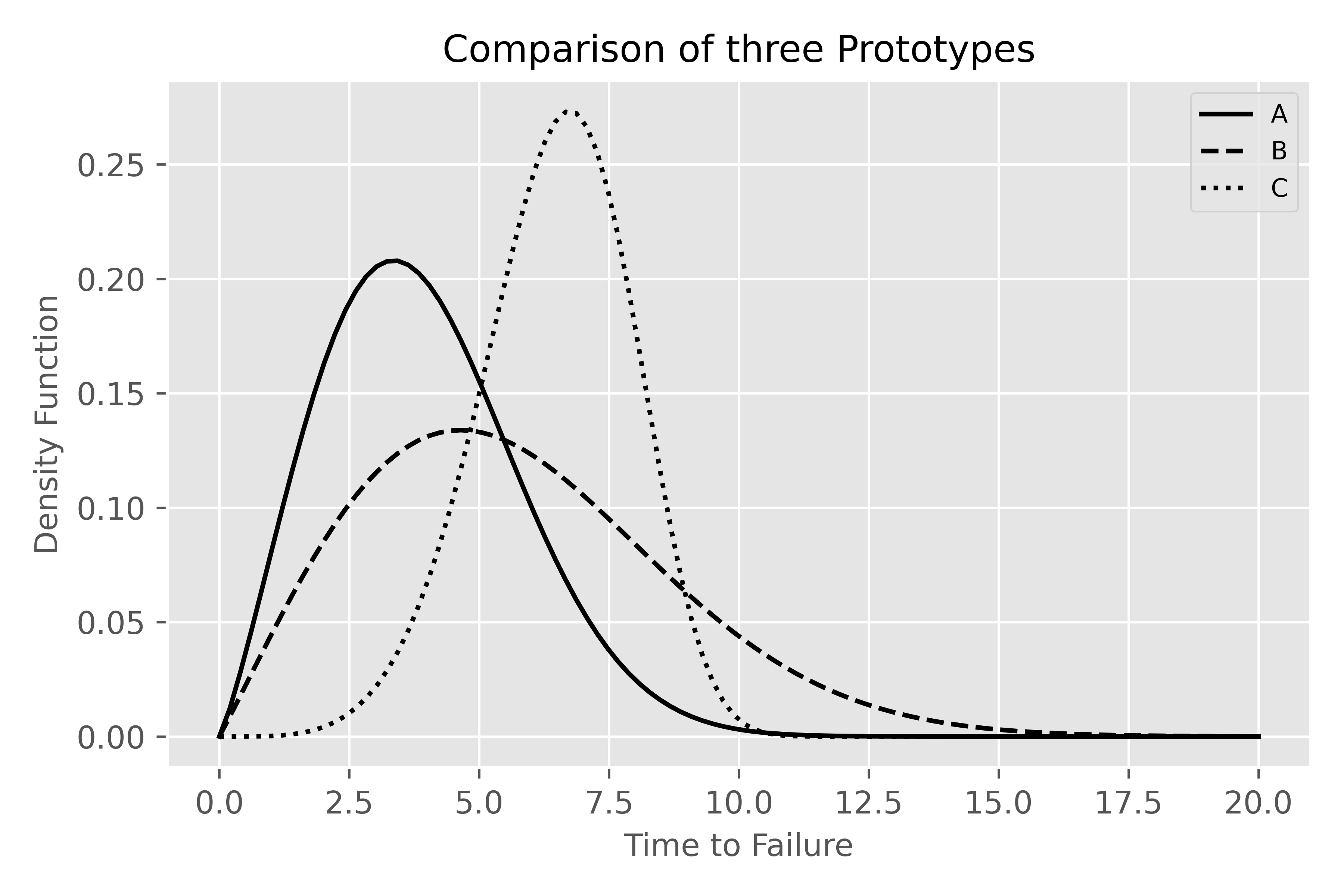
This method plots one or more Weibull probability density functions. Axes are completely customizable.
Arguments: weibull_pdf(self, beta=None, eta=None, linestyle=['-', '--', ':', '-.'], labels=None, x_label=None, y_label=None, xy_fontsize=12, tick_fontsize=10, legend_fontsize=9, plot_title='Weibull PDF', plot_title_fontsize=14, x_bounds=None, fig_size=None, color=None, save=False, plot_style='predictr', **kwargs)
from predictr import Analysis, PlotAll

# Use analysis for the parameter estimation
failures1 = [3, 3, 3, 3, 3, 3, 4, 4, 9]
failures2 = [3, 3, 5, 6, 6, 4, 9]
failures3 = [5, 6, 6, 6, 7, 9]

a = Analysis(df=failures1, bounds='lrb', bounds_type='2s', show = False, unit= 'min')
a.mle()

b = Analysis(df=failures1, ds = failures2, bounds='fb', bounds_type='2s', show = False, unit= 'min')
b.mle()

c = Analysis(df=failures3, bounds='lrb', bcm='hrbu', bounds_type='2s', show = False, unit= 'min')
c.mle()

# Use weibull_pdf method in PlotAll to plot the Weibull pdfs
# beta contains the Weibull shape parameters, which were estimated using Analysis class. Do the same for the Weibull scale parameter eta.
# Cusomize the path directory in order to use this code
PlotAll().weibull_pdf(beta = [a.beta, b.beta, c.beta], eta = [a.eta, b.eta, c.eta],
                      linestyle=['-', '--', ':'], labels = ['A', 'B', 'C'],
                x_bounds=[0, 20, 100], plot_title = 'Comparison of three Prototypes',
                x_label='Time to Failure', y_label='Density Function',
                save=True, color=['black', 'black', 'black'], path=r'/your/custom/path/test.pdf')
simple_weibull()
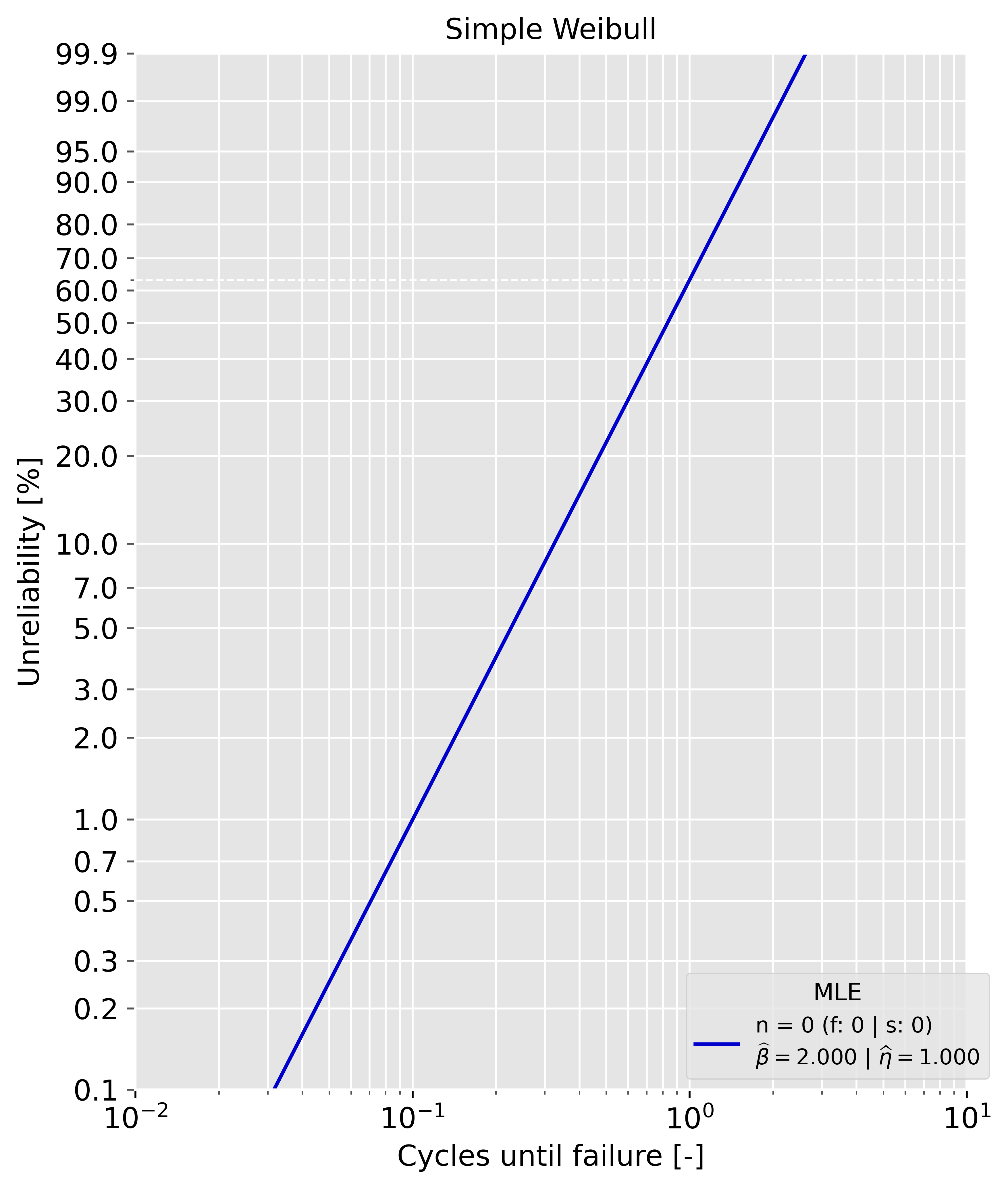
This method plots the Weibull probability plot for a given pair of beta and eta. If failures and/or suspenions are given, the median ranks are plotted as well.
from predictr import Analysis, PlotAll

# If save=True, you must set the path argument, e.g. path=r'/your/custom/path/test.pdf'
PlotAll().simple_weibull(beta =2.0, eta=1, show_legend=True, x_label='Cycles until failure', plot_title='Simple Weibull')
compare()
This method fits every distribution predictr supports (Weibull, Normal, LogNormal, Exponential) to one dataset and plots a probability-plot grid, ranked by AIC (or Anderson-Darling via criteria='ad'), each on its own native paper. With plot_pdf=True (the default), it also produces a separate figure overlaying every fitted PDF on shared, linear axes.
from predictr import PlotAll

failures = [93.34, 100.87, 96.41, 99.02, 108.9, 95.64, 102.31]
PlotAll().compare(df=failures, criteria='aic', plot_pdf=True)
| Ranked by AIC | PDF comparison |
|---|---|
 |
 |
Regression
Regression fits lifetime (survival) regression models with covariates, for uncensored and right-censored data:
model='weibull_aft'(default) — a parametric Weibull accelerated failure time model. In log-location-scale formln T = xᵀθ + σ·WwithWstandard smallest-extreme-value distributed. The equivalent Weibull shape isbeta = 1 / sigma;exp(θⱼ)is the time ratio (acceleration factor) for a one-unit increase in covariate j.model='cox_ph'— a semiparametric proportional hazards modelh(t | x) = h₀(t)·exp(xᵀβ)with an unspecified baseline hazard (no intercept).βis estimated from the partial likelihood;exp(βⱼ)is the hazard ratio. Tied event times use the Efron (default) or Breslow approximation. The cumulative baseline hazard is the Breslow estimator, taken at the mean covariate vector, sobaseline_survis the survival curve of an "average" unit.
Both are derived and implemented from scratch (log-likelihood, score, observed information; Newton-Raphson with a quasi-Newton fallback). predictr conventions carry over from Analysis: the df/ds data split, cl/bounds/bounds_type, and the shared plot kwargs.
Default arguments and values
| Parameter | default | type | description |
|---|---|---|---|
| df, ds | None | list of floats | Failures / right-censored observations (predictr style). Use with x_df/x_ds. |
| x_df, x_ds | None | DataFrame | dict | 2D array | Covariate rows aligned row-for-row with df / ds (same columns in both). |
| data | None | DataFrame | One row per unit. Alternative to df/ds; needs duration_col and event_col. |
| duration_col | None | str | Column in data with the observed time. |
| event_col | None | str | Column in data with the event indicator (1 = failure, 0 = censored). |
| covariate_cols | None | list of str | Covariate columns in data (default: all columns except duration/event). |
| feature_names | None | list of str | Names for bare-array covariates. |
| stress_model | None | dict or str | {raw_column: law} to fit a named life-stress (aging) law: 'arrhenius' (temp → 1/(k_B T), coef = Ea [eV]), 'eyring' (temp), 'inverse_power' (positive stress → ln S, n = −coef), 'coffin_manson' (cycling range), 'exponential' (stress as-is). Peck (temp–humidity) = 'arrhenius' on T + 'inverse_power' on RH. A bare law name (stress_model='arrhenius') is shorthand when there is exactly one covariate column. |
| stress_units | None | dict | {raw_column: 'C' \| 'K'} for the temperature laws. Default 'C'. |
| model | 'weibull_aft' | str | 'weibull_aft' or 'cox_ph'. |
| ties | 'efron' | str | Cox tie-handling: 'efron' or 'breslow'. |
| fit_intercept | True | bool | AFT only. |
| standardize | True | bool | Center/scale covariates internally; results reported on the original scale. |
| cl | 0.9 | float | Confidence level for the bounds. |
| bounds | None | str | None no confidence bounds (the default, matching Analysis); 'fb' Wald bounds (observed information), 'lrb' profile-likelihood bounds, 'npbb' non-parametric bootstrap (resample units), 'pbb' parametric bootstrap (simulate the response from the fitted model). Bootstrap bounds are always two-sided percentiles (bounds_type is ignored) and drive both the coefficient table and the survival band. |
| bounds_type | '2s' | str | '2s', '1sl' or '1su'. Ignored by 'npbb'/'pbb'. |
| max_iter, tol | 100, 1e-8 | int, float | Newton-Raphson controls. |
| n_boot | 1000 | int | Number of resamples for bounds='npbb'/'pbb'. |
| strata, entry_col | None | – | Reserved for stratification / left-truncation (not supported yet). |
| show, save, plot_style, unit, x_label, y_label, xy_fontsize, tick_fontsize, legend_fontsize, plot_title, plot_title_fontsize, fig_size, show_legend | as in Analysis (fig_size defaults to landscape (9, 6)). |
||
| kwarg: path | string | Figure path/format when save=True. |
Methods
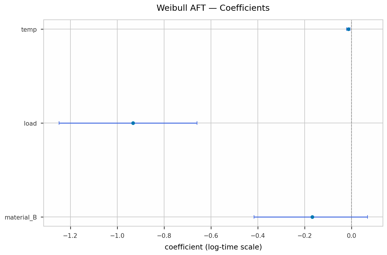
fit()— estimate the model, fill the result attributes, returnself.summary(decimals=4, print_report=True)— print the full report (model, sample sizes, log-likelihood, AIC, likelihood-ratio test vs. the null model, concordance, plussigma/shape for AFT) and return the coefficient table as apandas.DataFrame(coef,exp(coef),se(coef),z,p, and thecl-level bounds on both scales).predict_median(X)/predict_quantile(X, q, ci=False, cl=None, bounds=None)— AFT: predicted lifetime quantiles for covariate rowsX. Withci=Truealso returns(lower, upper)confidence limits (delta method forbounds='fb', profile likelihood forbounds='lrb', resample percentiles forbounds='npbb'/'pbb').predict_time_ratio(X)/predict_hazard_ratio(X)— multiplicative effect on lifetime (AFT) / hazard (Cox), relative to a unit at the mean covariates.predict_survival(X, times=None, ci=False, cl=None, bounds=None, simultaneous=False)—S(t | x). Withci=Falsea DataFrame indexed by time; withci=Truea dict{'surv', 'lower', 'upper', 'lower_sim', 'upper_sim', 'in_data_range', 'method', 'cl'}. The band is the delta method ('fb') or profile likelihood (AFT'lrb') on the complementary-log-log scale, or pointwise resample percentiles ('npbb'/'pbb');simultaneous=Trueadds a simultaneous band valid over the whole observed time range — the Monte-Carlo supremum of the estimated Gaussian process ofeta(t), with monotone-tightened edges ('fb'/'lrb'only).plot(show=None)— forest plot of the coefficients with their confidence bounds.
Every Regression plot method (plot, plot_survival, plot_gof, plot_stress_life, plot_km, plot_na) takes show= and defaults to show=True: the figure is drawn and the method returns None, so in Jupyter it appears exactly once with no trailing ; or plt.show(). Pass show=False to suppress the draw and get the Figure back for further composition.
- plot_survival(profiles, times=None, labels=None, ci=False, cl=None, bounds=None, simultaneous=False, target_bq=None, km_overlay=False) — predicted survival curves for one or more covariate profiles. ci=True draws the confidence band (solid + filled up to the last observed time, dashed + hatched past it, with a dotted vertical line at the last observed time carrying a small vertical t_max label); the legend carries the bounds method predictr-style (Fisher bounds @ 90% / Likelihood-ratio bounds @ 90% / Non-parametric bootstrap bounds @ 90% / Parametric bootstrap bounds @ 90%). simultaneous=True overlays the wider simultaneous band (dotted). target_bq=p (e.g. 0.1 for B10) draws the horizontal line S = 1 − p and adds the B(100p) life to the legend as B10: lower / median / upper (just the median when ci=False). km_overlay=True adds the pooled Kaplan–Meier estimate as a grey step line.
- residuals(kind=None) — per-unit residuals; kind=None returns a DataFrame with cox_snell (H(t_i | x_i); with the event flag it is a censored Exp(1) sample under a correct model), martingale (d_i − r_i, plot against a covariate to check its functional form) and deviance (symmetrised, ≈ N(0,1); large |·| flags poorly-fit units). Both models.
- goodness_of_fit(decimals=4, print_report=True) (alias gof) — a pandas.Series and a printed report grouped into discrimination / relative fit / absolute fit, each metric tagged [ good ] / [ marg ] / [ POOR ] and closed by a one-line overall: verdict (GOOD FIT / MARGINAL FIT / POOR FIT). Numeric keys: concordance, loglik, aic, the LR test, cox_snell_slope (slope through the origin of the Nelson–Aalen cumulative hazard of the Cox–Snell residuals on themselves over their lower 90 % — ≈ 1 for a good absolute fit; |slope − 1| ≤ 0.10 good, > 0.25 poor), cox_snell_max_dev (≤ 0.15 good, > 0.35 poor) and, for Cox, ph_pvalue (global proportional-hazards test). String keys: discrimination (weak/modest/good/strong from the concordance), absolute_fit, proportional_hazards (Cox) and verdict.
- plot_gof() — two panels: the Cox–Snell residuals vs. their Nelson–Aalen cumulative hazard (should track the 45° line) and martingale residuals vs. the linear predictor with a running-mean smoother (should stay flat on 0). The overall verdict is the figure suptitle (green / amber / red).
- check_ph(transform='km', decimals=4, print_report=True) — Cox only. Tests the proportional-hazards assumption per covariate by correlating the scaled Schoenfeld residuals with a function of time (transform: 'km', 'rank', 'log' or 'identity'). Returns a DataFrame (test_stat χ²₁, p, rho_time) with a GLOBAL row (χ² with p df); a small p means that covariate's effect changes over time.
- kaplan_meier(by=None, cl=None) / nelson_aalen(by=None, cl=None) — the non-parametric, covariate-free descriptions of the data: Kaplan–Meier survival S(t) (product limit) and Nelson–Aalen cumulative hazard H(t). No fit() needed — this is the model-free reference the fitted curves are compared against. by= splits into groups by a raw covariate column name (e.g. 'material') or a length-n array of labels. Returns a DataFrame [group,] time, n_risk, n_event, n_censor plus surv, surv_se, surv_lower, surv_upper (KM: Greenwood SE, band on ln(-ln S)) or cumhaz, cumhaz_se, cumhaz_lower, cumhaz_upper (NA: Var(H) = Σ d/n², band on ln H); cl defaults to self.cl. Same estimator engine as Analysis.kaplan_meier() / Analysis.nelson_aalen().
- plot_km(by=None, ci=True, cl=None) / plot_na(by=None, ci=True, cl=None) — step plot of the Kaplan–Meier / Nelson–Aalen estimate (one line per by= group), pointwise band when ci=True, censoring shown as vertical ticks. A single curve is drawn in predictr's single-result blue; grouped curves use the categorical palette (with linestyle cycling past 6) as plot_survival and PlotAll, except that palette slots 2 and 3 are swapped so a two-group split reads teal vs. purple rather than teal vs. a blue close to the single-curve colour.
- power_analysis(n=None, n_sim=500, alpha=None, coef=None, sigma=None, seed=0, print_report=True) — Monte-Carlo power for each covariate. The fitted model (or the coef/sigma overrides) is the ground truth; n_sim data sets of size n are simulated by resampling the covariate rows (and, if the data are censored, the censoring times), each is refitted, and a drop-one likelihood-ratio test is run per covariate. Returns a pandas.Series of rejection rates at level alpha (default 1 − cl), indexed by covariate name with an extra '(model)' entry for the overall LR test.
- sample_size(target_power=0.8, term=None, n_grid=None, n_sim=300, alpha=None, seed=0, print_report=True) — smallest n on a search grid at which power_analysis reaches target_power (for the weakest covariate, or the named term). Returns that n, or None if the grid tops out below the target.
With a stress_model (Weibull AFT):
acceleration_factor(from_, to_, cl=None)— lifetime ratiolife(to_) / life(from_)for two operating points given as raw-unit dicts (e.g.{'temp': 55, 'volt': 3.3});> 1meansto_lasts longer. Returns(factor, lower, upper)(delta method on the log ratio).plot_stress_life(q=0.5)— the life–stress diagnostic: each tested stress level's marginalB(100q)life (log y) against its stress linear predictor, with the fitted AFT line. Collinear points support the aging law.check_shape(decimals=4, print_report=True)— fits a separate Weibull per tested stress level and returns a table of shape estimates (with apooledrow); flags whether the shapes are consistent (the SAFT model assumes one common shape).- All
predict_*andplot_survivalaccept the operating point in raw stress units (dict / DataFrame) and apply the same transform.
Result attributes
coef, se_coef, z_values, p_values, ci_lower, ci_upper, cov, params_, summary_, loglik, loglik_null, aic, lr_stat, lr_pvalue, concordance, n, n_events, feature_names.
AFT also: intercept, sigma, se_sigma, beta (Weibull shape).
Cox also: hazard_ratio, hazard_ratio_ci, baseline_cumhaz ((times, H0)), baseline_surv ((times, S0)).
With stress_model (AFT): stress_params — DataFrame stress | law | parameter | value | se | ci_lower | ci_upper (e.g. Ea_eV, n), honouring bounds=.
Examples
Weibull AFT
import pandas as pd
from predictr import Regression

data = pd.DataFrame({
    'time':  [72.7, 28.0, 28.4, 37.4, 8.3, 17.6, 27.9, 16.4, 86.5, 19.8],
    'event': [   0,    1,    1,    0,   0,    1,    0,    1,    1,    1],
    'temp':  [  60,  100,   80,   80,  80,  100,   60,  100,   60,   60],
    'load':  [ 1.0,  1.5,  2.0,  1.0, 2.0,  2.0,  1.0,  1.5,  1.0,  2.0],
})

aft = Regression(data=data, duration_col='time', event_col='event',
                 covariate_cols=['temp', 'load'], model='weibull_aft', bounds='fb')
aft.fit()
aft.summary()

print(aft.beta, aft.sigma)                 # Weibull shape / scale of the error
aft.predict_median(pd.DataFrame({'temp': [60, 100], 'load': [1.0, 2.0]}))

aft.plot()                                  # coefficient forest plot
Cox PH (with separate failure / suspension lists)
from predictr import Regression

failures    = [28.0, 28.4, 17.6, 16.4, 86.5, 19.8]
suspensions = [72.7, 37.4, 8.3, 27.9]
x_failures    = [[100, 1.5], [80, 2.0], [100, 2.0], [100, 1.5], [60, 1.0], [60, 2.0]]
x_suspensions = [[60, 1.0], [80, 1.0], [80, 2.0], [60, 1.0]]

cox = Regression(df=failures, ds=suspensions, x_df=x_failures, x_ds=x_suspensions,
                 feature_names=['temp', 'load'], model='cox_ph', ties='efron',
                 bounds='lrb', cl=0.9)
cox.fit()
cox.summary()

print(cox.hazard_ratio)                     # exp(coef) per covariate
cox.plot_survival(pd.DataFrame({'temp': [60, 100], 'load': [1.0, 2.0]}))
Predictions per covariate profile
aft = Regression(data=data, duration_col='time', event_col='event',
                 covariate_cols=['temp', 'load'], model='weibull_aft',
                 bounds='lrb', cl=0.9).fit()

profiles = pd.DataFrame({'temp': [60, 80, 100], 'load': [1.0, 1.5, 2.0]},
                        index=['mild', 'mid', 'harsh'])

aft.predict_median(profiles)                       # B50 life, one per row
aft.predict_quantile(profiles, q=0.1)              # B10 life
tq, lo, hi = aft.predict_quantile(profiles, q=0.1, ci=True)   # + CI

aft.predict_time_ratio(profiles)                   # AFT: life vs. mean-covariate unit
# cox.predict_hazard_ratio(profiles)               # Cox: hazard vs. mean-covariate unit

S = aft.predict_survival(profiles, times=[10, 25, 50, 100])   # DataFrame, times x profiles
band = aft.predict_survival(profiles, ci=True)     # dict: surv / lower / upper / method / cl
Confidence bands and Bx life
aft = Regression(data=data, duration_col='time', event_col='event',
                 covariate_cols=['temp', 'load'], model='weibull_aft',
                 bounds='lrb', cl=0.9).fit()

# pointwise band, B10 marked, model-free KM overlaid
aft.plot_survival(profiles, ci=True, target_bq=0.1, km_overlay=True)

# add the simultaneous band (valid over the whole observed time range)
aft.plot_survival(profiles, ci=True, simultaneous=True, target_bq=0.1)

# B10 life with lower / point / upper, programmatically
tq, lo, hi = aft.predict_quantile(profiles, q=0.1, ci=True)
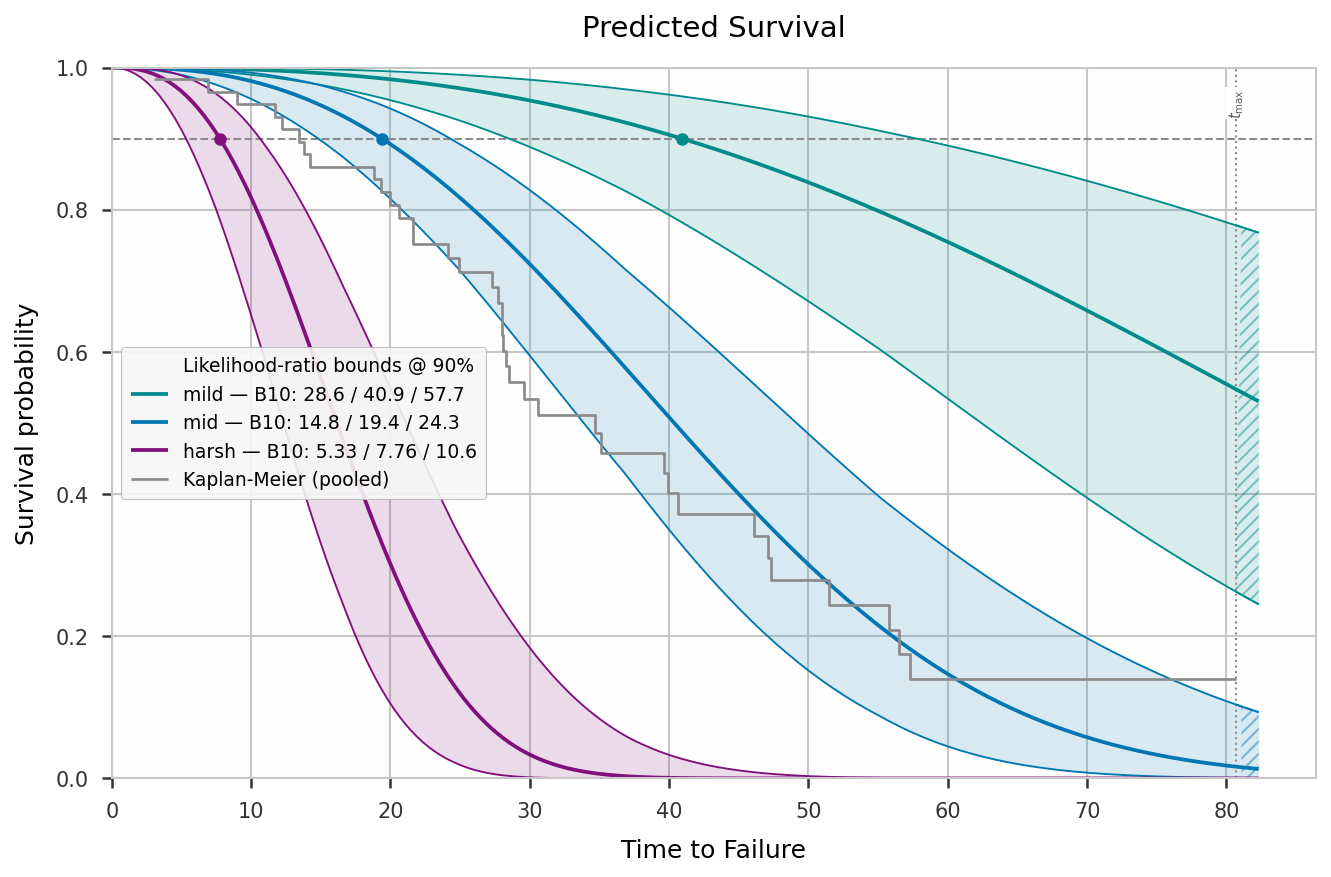
bounds= chosen at construction drives the band: 'fb' = delta method,
'lrb' = profile likelihood (AFT), 'npbb'/'pbb' = resample percentiles.
Past the last observed time the band switches to dashed + hatched and a
vertical t_max marker flags the start of extrapolation.
Bootstrap bounds
aft = Regression(data=data, duration_col='time', event_col='event',
                 covariate_cols=['temp', 'load'], model='weibull_aft',
                 bounds='pbb', n_boot=2000, cl=0.9)      # or bounds='npbb'
aft.fit()
aft.summary()                                            # percentile CIs in the table

band = aft.predict_survival(profiles, ci=True)           # pointwise resample band
aft.plot_survival(profiles, ci=True, target_bq=0.1)
'npbb' resamples whole units with replacement; 'pbb' keeps the covariates
and simulates the response from the fitted model (censoring times are drawn
from the observed censored units). Both feed the coefficient table and the
survival band; there is no simultaneous variant.
Goodness of fit
r = Regression(data=data, duration_col='time', event_col='event',
               covariate_cols=['temp', 'load'], model='cox_ph').fit()

r.goodness_of_fit()          # tagged report + overall GOOD / MARGINAL / POOR verdict
r.plot_gof()                 # Cox–Snell 45° check + martingale-vs-lp smoother (verdict as suptitle)

res = r.residuals()          # cox_snell / martingale / deviance per unit
r.check_ph()                 # Cox: proportional-hazards test per covariate

r.kaplan_meier(by='material')    # model-free S(t) table, split by a covariate
r.plot_na()                      # Nelson–Aalen cumulative hazard, pooled
r.plot_survival(profiles, km_overlay=True)   # + pooled Kaplan–Meier reference
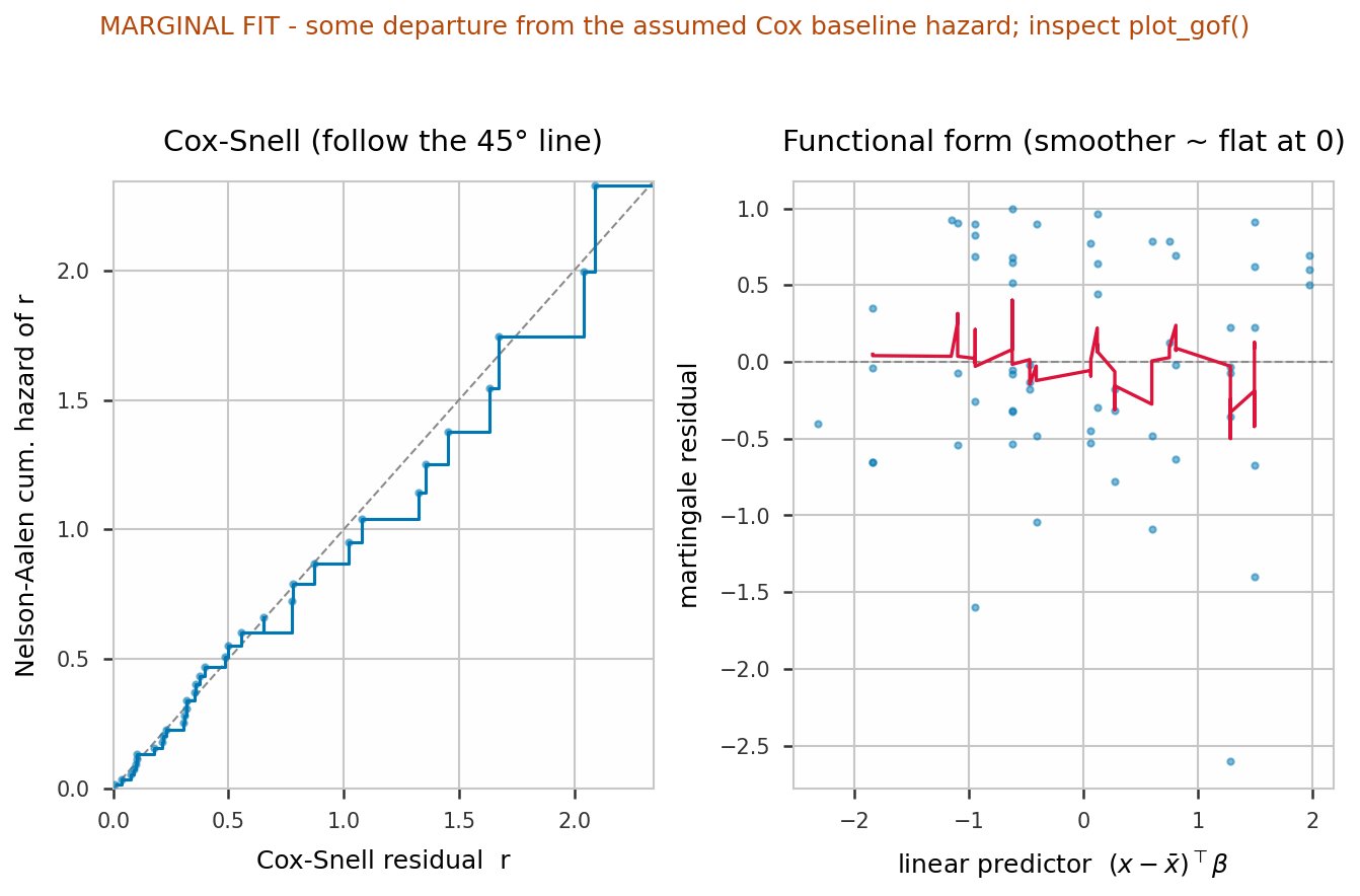
goodness_of_fit() covers discrimination (concordance), relative fit
(AIC, LR test) and absolute fit (cox_snell_slope ≈ 1, cox_snell_max_dev
small), tags each metric good / marginal / poor against fixed thresholds,
and prints a single overall: line — GOOD FIT, MARGINAL FIT or POOR FIT —
so the read is immediate; the same string is in s['verdict']. check_ph() is
Cox-only and flags covariates whose effect drifts over time (its global p-value
also feeds the verdict). For a parametric AFT, plot_gof() plus
km_overlay=True show whether the Weibull shape actually matches the data.
Kaplan–Meier / Nelson–Aalen (pooled and stratified)
Non-parametric, no fit() required — the model-free picture of the data.
by= splits the curve by a covariate column, which Analysis cannot do.
r = Regression(data=data, duration_col='time', event_col='event',
               covariate_cols=['temp', 'load', 'material'], model='cox_ph')

r.kaplan_meier()                       # pooled S(t) life table (DataFrame)
r.nelson_aalen(cl=0.95)               # pooled H(t) at a wider level

# stratified: one curve per material level, palette-coloured, with bands
r.plot_km(by='material')
r.plot_na(by='material', ci=False)

# split on a derived label array (length n) instead of a column
import numpy as np
hot = np.where(data['temp'] >= 90, 'temp>=90', 'temp<90')
km = r.kaplan_meier(by=hot)            # 'group' column: 'temp>=90' / 'temp<90'
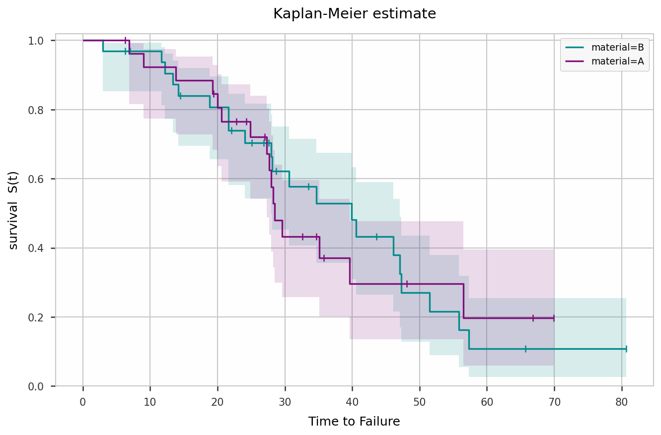
Parallel ln(-ln S) curves per stratum support the Cox PH assumption;
straight, equally steep strata on Weibull paper support a common AFT shape.
Power and required sample size
aft = Regression(data=data, duration_col='time', event_col='event',
                 covariate_cols=['temp', 'load'], model='weibull_aft').fit()

aft.power_analysis(n_sim=1000)                    # power at the current design
aft.power_analysis(n=120, coef=[-0.01, -0.7])    # a hypothetical effect size
aft.sample_size(target_power=0.8)                 # smallest n reaching 80 % power
Accelerated life testing — named aging laws
Parametric AFT extrapolation past the tested range is only trustworthy when the
stress carries a known life–stress law. stress_model names the law per raw
column; predictr applies the physical transform, reports the physical parameter,
and lets every prediction be made at raw-unit operating points.
import numpy as np, pandas as pd
from predictr import Regression

# df: hours, failed (1/0), temp_C, volt  — units tested at several temp/volt levels
m = Regression(data=df, duration_col='hours', event_col='failed',
               model='weibull_aft', bounds='lrb', cl=0.9,
               stress_model={'temp_C': 'arrhenius', 'volt': 'inverse_power'},
               stress_units={'temp_C': 'C'}).fit()

m.summary()             # coef table + "life-stress model" block:
                        #   temp_C  arrhenius       Ea_eV = 0.70  (0.62, 0.78)
                        #   volt    inverse_power   n     = 2.50  (2.16, 2.86)
m.stress_params         # the same as a DataFrame

use = {'temp_C': 55, 'volt': 3.3}                 # field conditions, raw units
m.predict_quantile(use, q=0.1, ci=True)           # B10 at field
m.plot_survival(use, ci=True, target_bq=0.1, times=np.linspace(1, 3e5, 300))
m.acceleration_factor(from_={'temp_C': 125, 'volt': 5.0}, to_=use)  # (AF, lo, hi)

m.check_shape()         # one common Weibull shape across stress levels?
m.plot_stress_life()    # life vs stress linear predictor + fitted line
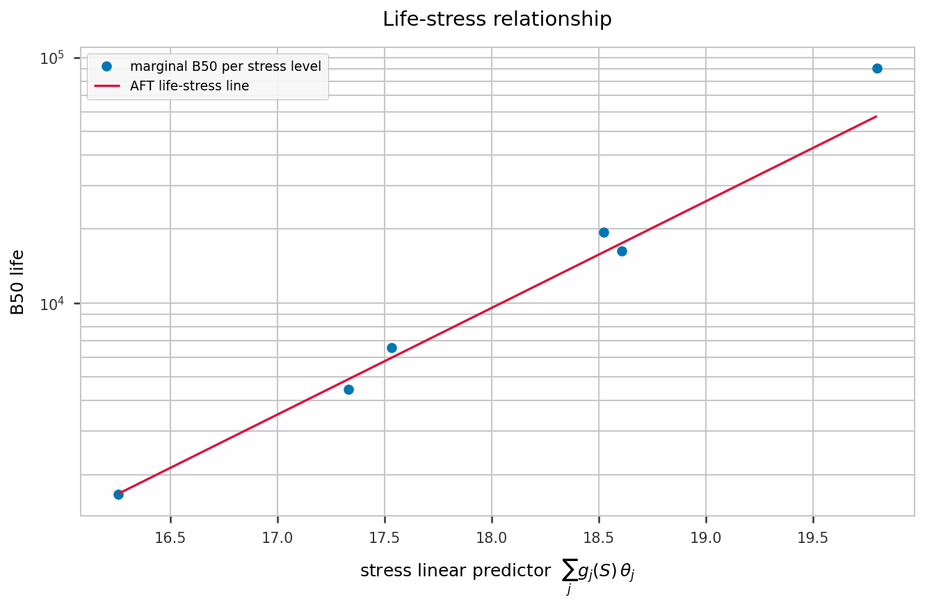
Single stress — the bare law name is a shorthand, temperature straight in Kelvin:
# df: hours, failed, temp_K  (one covariate)
m = Regression(data=df, duration_col='hours', event_col='failed',
               model='weibull_aft', bounds='lrb',
               stress_model='arrhenius',            # == {'temp_K': 'arrhenius'}
               stress_units={'temp_K': 'K'}).fit()
m.stress_params                                     # Ea_eV with CI

field = pd.DataFrame({'temp_K': [300., 320., 340.]}, index=['27C', '47C', '67C'])
m.predict_quantile(field, q=0.1)                    # B10 per field temperature
m.acceleration_factor(from_={'temp_K': 400.}, to_={'temp_K': 300.})
Other laws work the same way — e.g. thermal-cycling fatigue with
stress_model={'strain_range': 'coffin_manson'} (term ln(range),
physical parameter fatigue_exponent), the time axis then in cycles.
Manual transform (df['inv_T'] = 1/(df.temp_C + 273.15), covariate_cols=['inv_T', …])
still works and is equivalent; stress_model just adds the physical relabelling,
raw-unit predictions, and the two diagnostics. With model='cox_ph' the
transformed columns still fit and predict_hazard_ratio accepts raw units, but
stress_params/acceleration_factor/plot_stress_life/check_shape are AFT-only.